How Do You Build an Effective Nonprofit Website?
Your nonprofit is a labor of love, and your team is driven by your mission. Make your site attractive and easy-to-use so others will be driven to your mission, too. Read on to learn the principles of web design and development that will have the greatest impact on your site and budget.
Analyzing The Top 15 Nonprofit Websites
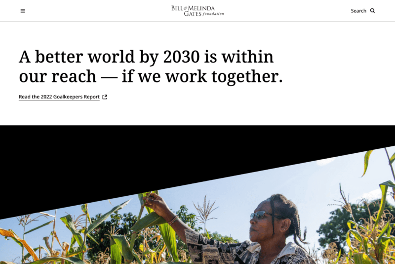
Bill & Melinda Gates Foundation
The foundation started by Bill & Melinda Gates has a persuasive impact statement to trumpet and they know how to do it. They use white, an easy background color, and black to focus your attention on the report.
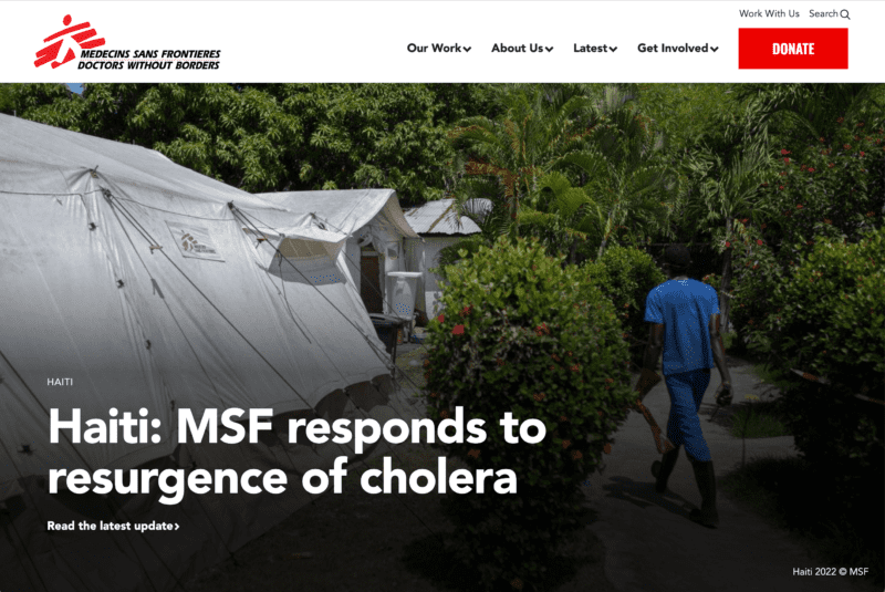
Doctors Without Borders
See a photo of people in a crisis with red highlighted text that says you can make a difference. Doctors Without Borders gets right to the point.
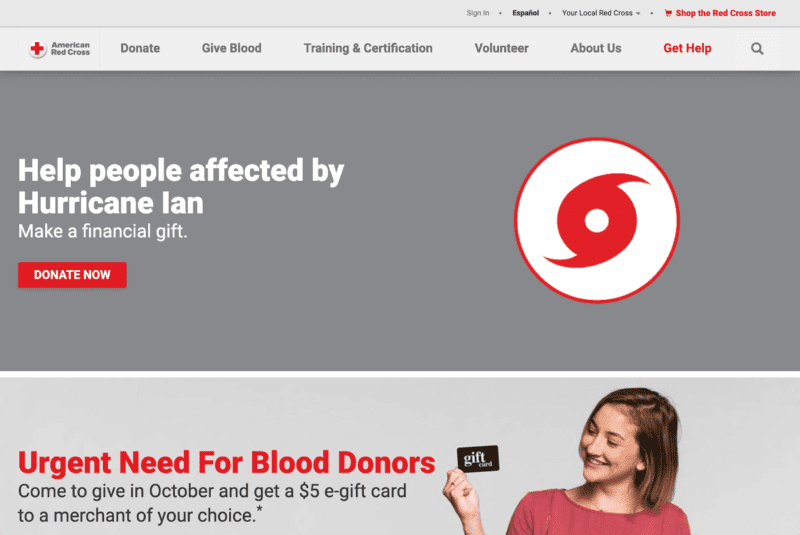
American Red Cross
Appointments and donations are the first actions that the American Red Cross highlights. People know this organization helps, what’s most important in that case is to drive a well of interest to action.
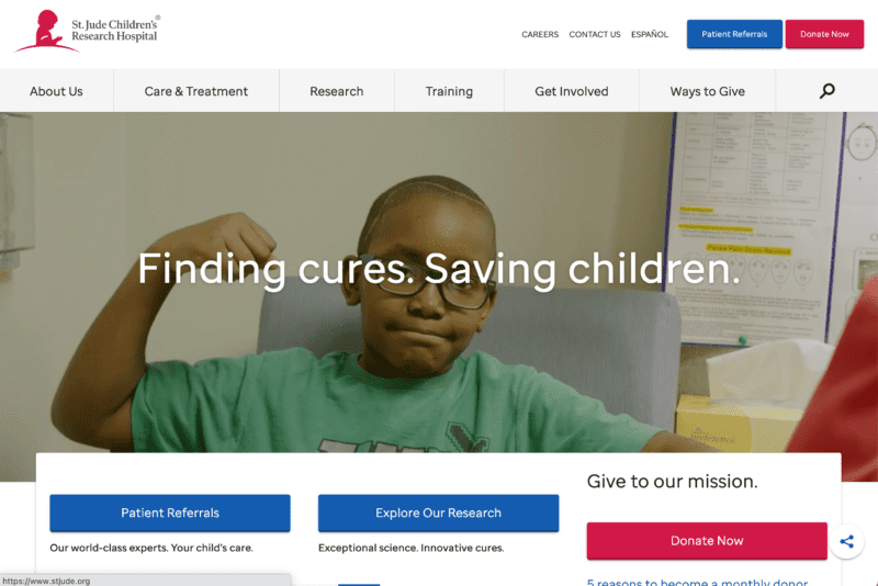
St. Jude Children’s Research Hospital
A doctor with a smiling child? That’s St. Jude’s, with the correct tone of bright colors and white.
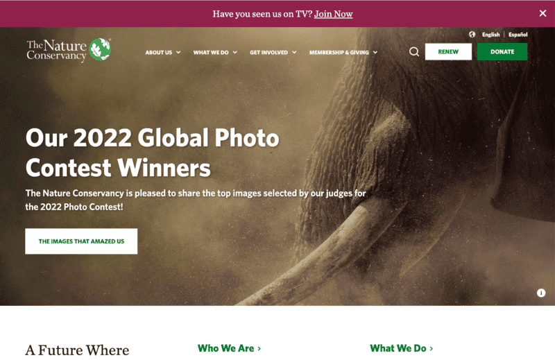
The Nature Conservancy
If you wanted to preserve natural wonders, resources, and beauty, what might attract your attention? The Nature Conservancy prominently does so with a lush, rich image of a butterfly on a flower.
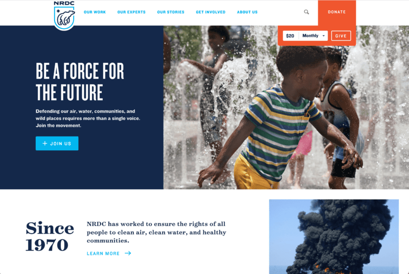
Natural Resources Defense Council
This nonprofit reminds people they get a tax deduction for donating to a cause worth many contributions.
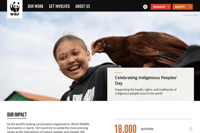
World Wildlife Fund
Connect your cause to others and show people the panoply of community problems they help heal when they contribute to you. The World Wildlife Fund connects protecting endangered species with Native Americans’ sovereignties and cultures.
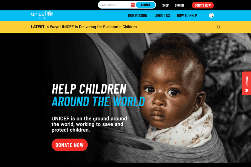
UNICEF USA
A clean top menu with crisp sequences of black, powder blue, and white frames a mission-centered photo. UNICEF USA had its visual web design done well.
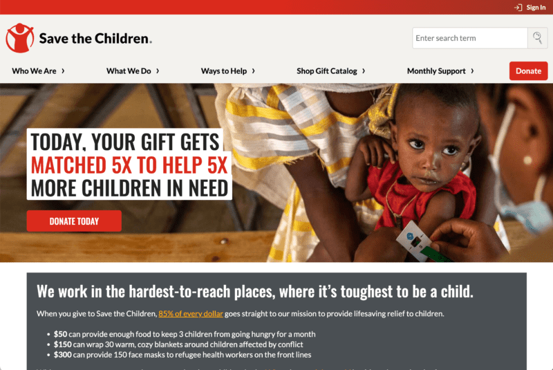
Save the Children
Hit the home page and your eyes go straight to a child’s eyes, then persuasive writing next to a donate button. It just so happens that the child’s shirt is red and so is the button.
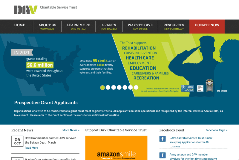
Disabled American Veterans Charitable Service Trust
A carousel on the DAV Charitable Service Trust home page shows interesting information about the mission and a clean white bar above the top menu stacks the visuals nicely.
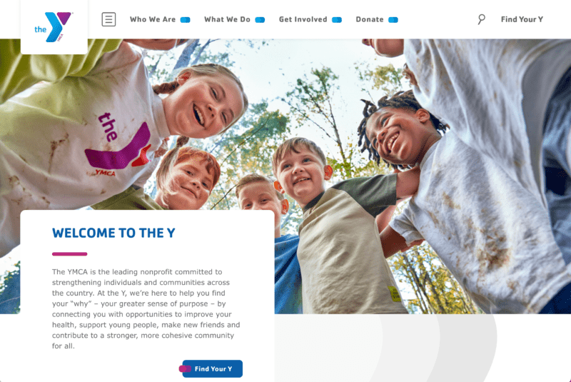
YMCA of the USA
The Y provides healthy recreation, socializing opportunities, and community bonding. A group of children smiling in the bright sunshine is a sign of the unique community service value of the Y. It takes up a large amount of space, and the rest of the page isn’t cluttered.
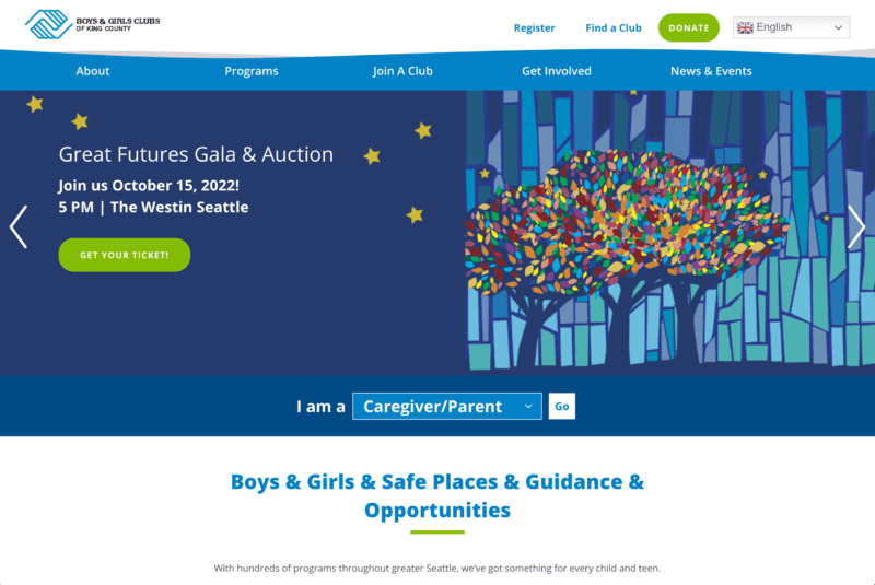
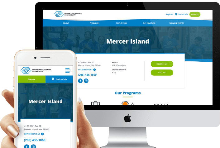
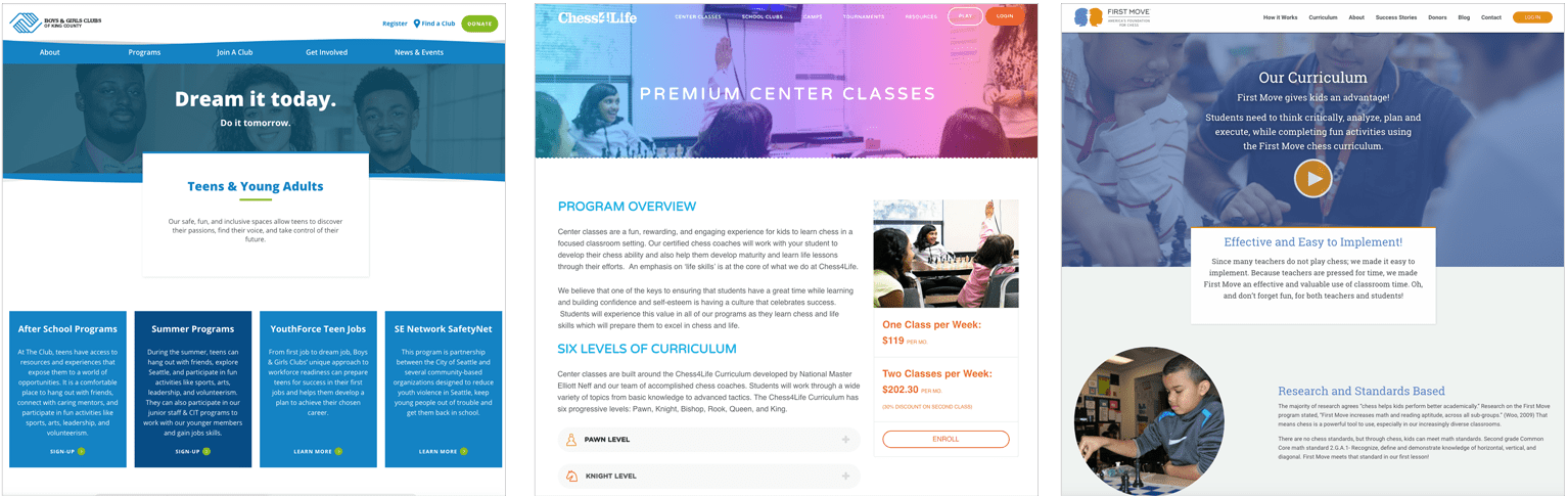
Boys & Girls Clubs of America
A content-rich but not too-long video is a good way to break apart reading of text, and is a harder leap in content creation than images in general. Notice how the video (with individual stories in it) pops out crisply and loads quickly.
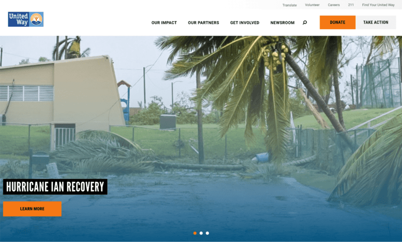
United Way Worldwide
They use white space generously to guide attention. This helps emphasize certain critical facts, including ones that would look tremendous in an impact statement, like how many people they have helped.
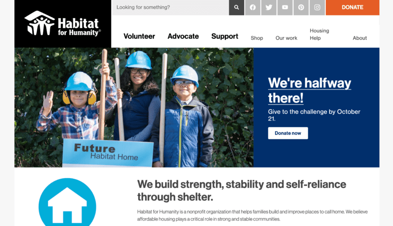
Habitat for Humanity International
The website makes it clear from the get-go that this nonprofit helps supply shelter to families. The service is clear, the emotional impact is immediate.
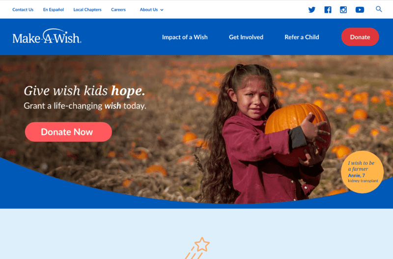
Make-A-Wish Foundation of America
Make-A-Wish uses one primary color, a darker blue with white as the safe background color. On the home page, a smiling adorable child is the first thing your eyes snap toward.
Sayenko Design’s Approach To Nonprofit Website Design
We know that nonprofits are busy. That’s why we offer a streamlined process that will save you time and money. Our team of experts will work with you to create the perfect site, so all you have to do is focus on what matters most – your mission!

We recommend starting with a strategy that appeals to those who cherish your cause, and organizes the site’s user experience so they can find their way to engagement and donation opportunities.
Our approach to nonprofit web design is to start from the strategy, building wireframes that map out how information will be presented, then bring your nonprofit’s brand to life through visual design and animation. Everywhere you look, the page design matters.
We build custom code on top of proven WordPress themes, which not only speeds up your nonprofit website’s development time, but also makes it significantly easier to manage on the backend once we hand the site off. We make it so you don’t have to call us up every time you want to change a headline or add a new blog post.
Getting discovered by your group of givers means optimizing for the things they search for. We optimize the code of your site to gain the most organic traffic possible, and create content strategies that keep you posting search-worthy content about your nonprofit’s cause.
Our Nonprofit Websites Case Studies
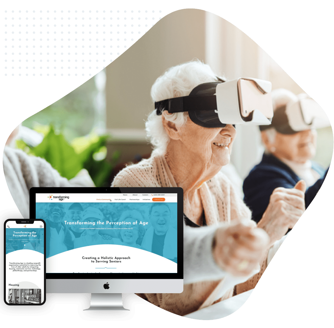
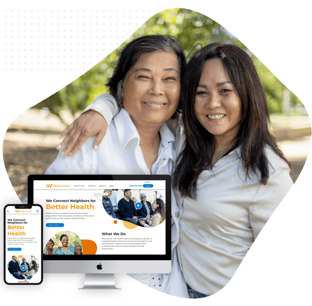
Transforming Age
This project involved helping a nonprofit dedicated to serving seniors with online access to a holistic set of services, including housing. The key was to make a clean, easy-to-use website for seniors for whom Transforming Age makes a significant difference.
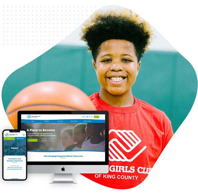
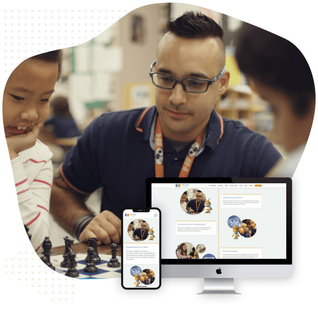
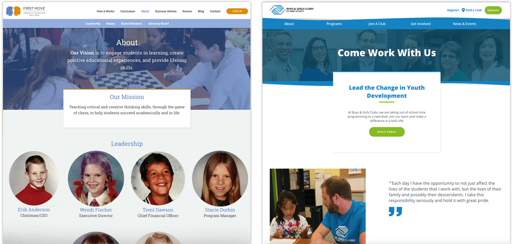
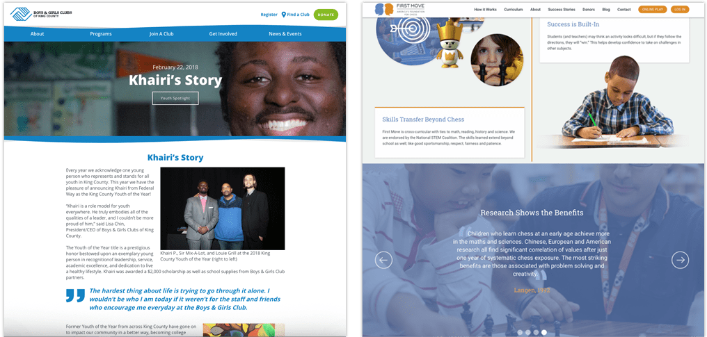
Boys & Girls Club
This famous after school and childcare program needed to bring their many distributed clubs under one cohesive umbrella. From both a storytelling and a technology perspective, we helped make their mission easier than ever to achieve.
The Basics Of Nonprofit Website Design Strategy
Start with Your Story
Potential supporters need to know who they’re helping and why. Tell them where you started, where you’re going, and what impact you’ve had so they feel inspired to be a part of it.
Use Content to Attract Supporters
Give visitors something interesting to do or look at as soon as you can. Put strategic actions like volunteering or subscribing, and blurbs or mission-related flavor text throughout every page and piece of content they might land on. Think of it as a 5-second rule for potential donors and volunteers.
Design for Visitors and their Journey
You’ve got to understand who your audience really is, what problems they’ve got and how they’re getting a solution with you. As a nonprofit you’re figuring out (a) who wants to give to you, (b) what motivates them to give and remember later, and (c) how can we get them to spread the word?
Focus On Conversions
Everything on your site should drive towards a handful of important goals: driving donations, gaining volunteers, building awareness and telling your story. That doesn’t mean being unsubtle or desperate in the language, but each page, section, and activity should have a way to tie into the core goal that keeps the organization alive and doing its important work. Your blog may ask for joining an email newsletter, but in some of those emails you’ll be pushing subscribers to donation drives or volunteer opportunities, as an example.
Give Them Your Number(s)
Potential donors are always interested to see results. Show them your work and your wins through impact statements backed up by statistics. Always tie it back to the human face, the people, animals, environments, and goals being served.


Visual Design Of Nonprofit Websites
How a nonprofit’s website looks can have a big impact on its success. Explore some of the most important aspects to visual design that your nonprofit’s website should consider.
Minimalism Helps Your Message Shine Through
Clutter is a conversion killer when it comes to nonprofit website design. Make sure each element serves a purpose—even if it’s aesthetic it should be to create a desired feeling in the visitor that ties into your mission and vision.
Consistent Branding Builds Trust
When you’re asking visitors to put in financial information for donations, they need to get a professional, trustworthy feeling from the site. Keep the colors, fonts and spacing choices consistent. In general, choose one primary color with one or two secondary colors, and clean and neutral background colors like white, off-white, and beige.
Say a Lot with a Little
Space words out. Give nice breaks between sections and also paragraphs, which should be 2-3 sentences max. And don’t forget the rich media to break it up. Reading is more enjoyable when there are quick video clips and mission-focused pictures that are still relevant to the piece.
Animation Shouldn’t Distract
It’s easy to overwhelm visitors with tons of animated elements. Keep them subtle, and directive, like a clickable button fading into view, or some photos appearing sliding into frame as the page scrolls and loads.
The Sum Equals More than its Parts
Pay attention to the mood created by the site as a whole. It’s easy to get caught up in the individual design choices, like “we like purple” and “these two fonts look nice,” and “we want to have lots of photography.” But at the end, review the page and site holistically, to make sure that the mood is fitting to your nonprofit’s mission and the story you’re trying to tell.
Keep Up with Trends
When building your new nonprofit website, explore the latest technical and artistic trends in web design to avoid turning people off by looking terribly outdated.
The Nonprofit Website Design UX (User Experience)
User experience is basically all of the elements that help visitors to the site get from where they start to the final destination, both to suit their goals and yours. Explore the important elements of UX that all nonprofit websites should consider.
Navigation
The top navigation is the header bar that has elements like your logo, and the major sections of your site. Things to consider are how many sections to include, and if they need drop downs. For example, most nonprofits would have a section about their mission, impact and case studies, opportunities for volunteering, and a donation section. The goal is to get visitors to important sections of the site without too many clicks. If you find your plan has too many drop down items, you might consider something called a “mega menu” where hovering over one button brings down a whole multi section menu where visitors can pick what they want in fewer clicks. A good use of this might be if your nonprofit operates in a number of regions, each region can have its subsection on a mega menu.
You also need to consider how the menu will behave on mobile devices, since there’s less space to work with, and no hover effects available.
Clear CTA and Buttons
One of the most important elements, both in the navigation bar, and around the site, are the “Calls to Action” or “CTAs”. These are the buttons that take visitors to pages like donation, volunteering, and subscription forms, where conversions happen. Be direct in the text, and use imperative language. The button color should also be one that is used almost nowhere else on the site and stands out, so it draws visitors’ eyes.
Hierarchy of Information
Convey key information concisely and effectively. The most important information always comes first in any well-designed page. Readers ought to know who you are, what community or region you serve, what your mission is, and what they can do to be a part of it, as soon as possible.
Mobile First Optimization
With mobile devices making up well over 50% of web traffic for years now, mobile optimization of your website is table stakes. Begin design with mobile devices in mind, and use the desktop version of your site to expand and build out more design considerations. Things that make mobile optimization easy: less text, fewer intrusive design elements, scroll-friendly layout, and an easy way to hop back to main navigation anytime.
Easy-to-Fill Donation Forms
If it’s easier to do, more people will do it. Not only should your forms have as few fields as possible to reduce friction in filling them out, but also they should use a proven nonprofit donations platform that integrates well with WordPress (or your website). The Gravity Forms plugin for WordPress is an excellent choice as you can easily accept payments, integrate with third party platforms, show form submissions on the back-end for easy management, and has great support if you ever get stuck. Many nonprofits don’t have the budget for a dedicated tech person, so something that’s easy to operate on the backend for a layperson or volunteer is a safe bet.
Minimal Pop Ups and Distractions
In the spirit of using up all your site space to drive people to donate, volunteer and otherwise engage, you may find yourself using too many pop-ups and too little space. Use your judgment, holistically over each page, to reduce burden on the reader and focus their experience.
Good Off-Site Experience
Your website is only one part of your nonprofit’s digital presence. For example, after a donation, does the email receipt donors receive match the design and language of the site? How about marketing emails? Also, consider social media. When you or your followers post a link to one of your pages, what does it look like on that social platform? You can influence that with a custom “open graph” tag, including image and headline, for each page. Anywhere people interact with your site, it should take the brand and the user journey into account.
The Technical Aspect Of Nonprofit Website Design
Website Builder
There are a variety of website builders, but by far the most popular is WordPress, which powers 58% of all websites online. Nonprofits who build on WordPress can benefit from a large proportion of developer support for important plugins, easy backend management for non-expert staff, and a wide variety of agencies and freelancers who are familiar with WordPress when they need support.
Hosting
Hosting is basically the servers where your website lives. The most important thing about a hosting service is that it has solid security, and it can scale up to the level of website traffic your nonprofit gets now and in the future. It’s recommended to not skimp on the hosting fees, and consider them a utility—a cost of running your nonprofit effectively.
SEO
Search Engine Optimization or SEO is the practice of making sure the code and content of your site are the best they can be for attracting relevant traffic for your nonprofit. To that end, your site should be built on a platform that’s easy to add content to, and easy to modify backend “metadata” that influences its search ranking. WordPress is one such platform.
Analytics
To know if your website is doing its job, you need a data source for your analytics. The most popular (and lowest cost at free) is Google Analytics. It can tell you how many people are visiting, where they’re coming from, and if you set up tracking it can tell you how many leads convert, and what value they bring to your nonprofit.
Accessibility
Accessibility is a concern for all organization’s websites, and nonprofits who often serve the underserved should especially pay attention to this for differently abled visitors. Not only that, but WCAG standards are beginning to be a legal requirement—they include things like adjustable font sizes for vision impared, alt text on images for compatibility with screen reading devices, and other important factors. Any web developer you work with should be familiar with WCAG standards.
Donations
The backend platform you use to manage donations should be reliable, and hopefully not take too much of a percentage of your donations. Look for providers that specialize in nonprofit donations, as you’ll pay less in fees (around 2-2.5%). Avoid using general payment service providers such as PayPal which typically have higher fees.
Security
Good code and good right-of-access practices will secure your nonprofit website from unwanted presences and extractions of information. For example, if you use WordPress, make sure whoever manages the site at your nonprofit keeps the WordPress build and its plugins up to date, monthly or even weekly.
Integrations
Select your payment method and processor for those much needed donations. Also consider integrations for things like your email sending service, event scheduling, and donor relationship management. Your nonprofit website developer needs to be aware of any technology and subscriptions you’re bringing into your project.
Responsive design
Don’t let device type or screen size hinder a helping hand from handing your nonprofit much needed support. Render all loads well with responsive design applied throughout the site.
Compressing for Page Speed
Make sure visitors can load your nonprofit website as fast as possible. The right technical know-how can turn page load times down big time, which makes it less likely that visitors abandon the site.
WordPress plugins
You can field important functions, like donation payment processing, event scheduling, and form building, through use of WordPress plugins made ready to use. Just make sure not to use too many, as these can clog up your site’s code and make page loading slow, or even result in incompatibilities that make the site crash. A good rule of thumb is 15 or fewer plugins running at one time.
Share Your Mission and Team with About Pages
The primary goals of the About Pages are to build trust and accurately communicate the mission, vision, and values of your nonprofit. As the 2nd most popular page of a website, it’s important to develop quality content for it. Share its history, accreditations, associations, and personal story with all interested visitors. But a nonprofit is nothing without its people, so be sure to highlight the stories of employees and leadership to establish authority and trust in your ability to run high-quality programs. For each staff member, provide consistent headshots, their contributions to the cause, and bios that highlight their passions and skills.
Blog with a Passion
As a mission driven organization, your nonprofit’s website should have a blog built in, where various members of the team should write about the stories they encounter. By writing a lot and updating it regularly, this blog will help your nonprofit website to build credibility in its field, which helps with search engine optimization (SEO). The more unique and high-quality content you have, the more Google can use to determine that your site is a good fit for relevant searches. And when people find these passionate blogs, they’ll be inspired to donate, volunteer, and more.
Drive Interest in your Nonprofit Programs
The goal of the program pages should be to help potential participants make an educated decision about enrolling WITHOUT having to speak to someone by phone or email. At the same time, it should demonstrate value and merit to potential donors who want to feel they’re putting their money in the right place. Visitors viewing these pages have an interest in your organization programs, but may not be aware of the finer points of how your nonprofit operates. It will be important to explain naming conventions and compare one to the other. This will help visitors find exactly what they are looking for.
Above the fold
“Why should I care?”
“What is it?”
“Who’s it for?”
In the Body
“How will it improve my life, and the lives of others?”
“How does it work?”
“Why should I trust you with my donation?”
At the Bottom
“What’s next?”
“How do I get started?”
Get Visitors Involved & Donating
These pages should remind visitors how they make a difference by becoming members, donating, or volunteering. They’re at the evaluation stage, and just need a little push and some final information to make their choice. Instructions and FAQs on how to get involved should be abundant. The FAQ page can capture any secondary objections that are not addressed on the primary “Get Involved” pages, as not fully understanding what one gets for signing up is the top reason for users bounces from a page instead of converting. Reasonable efforts should be made to explain exactly the process and benefits of each conversion possibility.
Donations don’t just happen. It takes strategy, care and a little elbow grease to put the right wheels in motion. If you’re looking to take your online fundraising efforts to the next level, it’s time to reexamine your website’s donor flow—the process of moving someone from a passive visitor to a committed supporter.
Save Time by Keeping your Existing Tools
Integrate your nonprofit website design Seattle with popular site tools, donor management systems, email services and more by hiring a company dedicated to nonprofits. Your website should improve and enhance marketing and sale related efforts. These tools include: MailChimp, Constant Contact, Qgive, Stripe, PayPal and more.
Create a Cost & Donation Calculator
Many 501(c)(3)s and other nonprofit organizations are required by law to publish their finances and costs for the sake of investors, donors, and tax collectors. Go beyond being transparent for the law’s sake and instead turn it into a selling point for potential donors with a feature like a donation calculator. Partner with a developer who can make interactive infographics so visitors can see what amount of a donation goes to what parts of the org, and put it in human terms that encourage them to complete the donation.
How much would it cost to level up your nonprofit’s digital presence and lean into an inflow of donations and positive attention? Compute what you need and what would be even better with Sayenko Design’s website cost calculator.
Overcome Objections with Success Stories
Case studies and success stories are powerful for potential participants and partner organizations, because they can see what outcomes you’ve already achieved and want the same thing for themselves. The case study should focus on the needs of the communities or causes you server. Break it down into what the goal of a project or program was, what was done to meet that goal, and the final results—complete with testimonials and pictures of smiling faces, hopefully. For donors and partner orgs, break down costs and staff activity in a transparent way so they feel confident contributing to the nonprofit.
Invest in Video & Photography
A picture’s worth a thousand words, and a video is worth infinitely more. While your copy should convey your story well, what visitors to the website will remember are the photos of people, animals, and regions being served by your nonprofit. These create the emotional connection first and foremost, and there’s a big difference between original photography and some decent looking stock—people can always tell.
Nonprofit Website Design FAQ’s

What Our Nonprofit Website Design Clients Are Saying
“We’ve seen a huge improvement. We have integrations with search engines and with digital marketing, as well as the ability to build landing pages for content and various campaigns throughout the year. I can foresee all the benefits that the site will bring. It’s a lot easier to manage and I’m sure it will increase and drive our revenue in 2018.”
~ Chris Brown, Boys & Girls Club of King County, Marketing & Communications Director