

What is the main purpose of a website?
There are websites for everything, from hobbies and personal journals to discussions and stores—but at the end of the day, the main reason for most websites’ existence is to drum up business leads or generate money. It can be direct, like selling products through ecommerce, or indirect, like keeping attention long enough to make ad revenue, or making someone interested enough to fill in a lead form.
If that’s the goal, then what makes for a good user experience (UX)?
A good user experience design is one that prioritizes how users get from their starting point to the point of conversion and revenue generation. That means it needs to make that user journey easy. Frictionless. Obvious. And it has to work for the kinds of people who visit that site. The right-brained audience needs an emotional connection with the content, a pleasing aesthetic, clear visual cues to lead them where you want them to go. The left-brained audience needs clear, logical layouts, and data-driven resources that provide value, and make them want to stay and click.
If this is so clear, where do some web design agencies go wrong?
Many web designers are too focused on the “design” part of their title. They’re obsessed with the latest trends and pushing their portfolio from a visual perspective only. You show them some sites you like and want to model off of, and they get to work on mockups. These designers see so many websites with standard features in navigation and organization that they want to be more artful and subtle—so subtle that the majority of users have no idea how to use the site and bounce. This is what we call “backwards web design.”
Instead of starting with the visuals, a good web design agency in Seattle should start with the strategy first, then content, and lastly web design services which conforms to the previous two steps. You have to consider the user’s needs, challenges, motivations and behaviors, not just make a snazzy design that might win awards. It’s a waste of time, energy, and money to go the other way, and you’ll be shopping for your next web design agency after a few months of watching traffic and revenue slope downward.
The 22 UX web design principles and best practices in this article will help you not only build a more effective website, but also delight, connect, and build a memorable experience that stands out from the pack.
User Experience Web Design Principles:
Website Content
Map Content to the User Journey
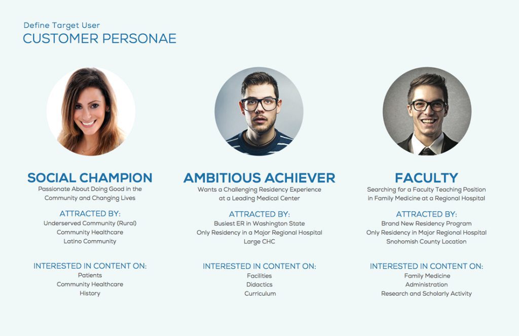
1. Know Your Audience
You can’t capture an audience’s heart if you don’t know what they think, feel, need, and want. Before you worry about making compelling content, learn about your current users and the users you hope to have. Create target personas that reflect the different types of customers you could serve, and a user flow chart that helps you understand what they’ll see first, next, and last. Only then can you map content out that will appeal to their needs and perspectives.
Key Takeaways
2. Pass The Trunk Test
Each page’s content should have a clear hierarchy. The users should be able to answer these questions on any site they visit: what site is this (is your logo visible?), what page am I on (is there a clear H1 headline), what am I in the site scheme (is there a breadcrumb available), and what are my options (make clickable elements obvious). Good UX in content means the user is never feeling lost for long.
Key Takeaways
3. Make Your Content Scannable
People’s attention spans are shorter than ever. The average site user spends 1-2 minutes on a given website, which isn’t a lot of time to get their attention. Reduce the cognitive load of your design with short, concise, value-driven messaging, and split into easy to scan headlines. Ideally, a user could progress through your funnel without really having to read small body copy.
“Simple can be harder than complex: You have to work hard to get your thinking clean to make it simple. But it’s worth it in the end because once you get there, you can move mountains.”
~ Steve Jobs
4. The Homepage is an Elevator Pitch
The user should know within 3-5 seconds what your company does. The most important info should stand out from the rest in that time, and someone who’s never heard of you should be able to recall what that information is. The homepage is about building a brand narrative with storytelling, and answering users’ main questions. Who are you? What do you do? How do you do it? Do you do a good job? Why should I go with you? And what should I do next? The goal is to build trust and credibility, without leaving the user stranded.
Key Takeaways
5. Scrolling is Easier than Clicking
While it’s true that your most essential content should live above-the-fold, the stuff below isn’t doomed to invisibility. Thanks to years of mobile web use and social media feeds, the average user has been trained to scroll down on a new site almost automatically. Not only is it expected, it’s typically faster and less mentally taxing than choosing a nav item and clicking on it, so placing information in section blocks to tell more of the story as users scroll is a great way to parse out information.
For example, if you’re a service-based business, you could group related resources, projects and case studies, and testimonials all on one page to be discovered as users scroll. Keep priority in mind, since you will lose more and more eyes the lower down the page a piece of content lives.
Key Takeaways

6. Answer Users Questions
Anticipate the kinds of questions users will have on your page, and answer them throughout the content in a logical way. The main things people want to know about your offering are “does it solve our problem(s)?”, and “what are the benefits?” From there, more specific questions can be considered, like specifications about your product or service. Don’t leave them in suspense, answer the questions when they’d be most likely to be curious about the answer.
Key Takeaways
7. Optimize Text Container Width
Remember, the main goal is to get users to read the first few sentences. If you can hook them there, then they’re more likely to read more content, possibly all the way to the end. And to that end, your content areas shouldn’t be too wide, otherwise users on standard and extra large screens will find it difficult to track the words and bounce. Shoot for 480 to 700px width max.
“Typographical researchers, Bruijn et al., found that people prefer shorter line lengths when reading content online because it appears more organized and easier to understand.”
– source: Social Triggers
8. Body Text Should Be No Less Than 16px
Anything less and you will lose some users due to eye strain, especially if your target audience is mid 30’s and above.
Fun facts – “At age 40, only half the light gets through to the retina as it did at age 20. For 60-year-olds, it’s just 20%. 16-pixel text on a screen is about the same size as text printed in a book or magazine; this is accounting for reading distance. Because we read books pretty close — often only a few inches away — they are typically set at about 10 points. If you were to read them at arm’s length, you’d want at least 12 points, which is about the same size as 16 pixels on most screens”
– source Smashing Magazine“[16 pixels] is not big. It’s the text size browsers display by default. It’s the text size browsers were intended to display… It looks big at first, but once you use it you quickly realize why all browser makers chose this as the default text size.”
– As usability expert Oliver Reichenstein says in “The 100% Easy-2-Read Standard”
9. Don’t Make Me Think
You don’t need to reinvent the wheel when it comes to navigation. Remember that a user wants to get to the content they need with the least amount of resistance possible. The navigation should be descriptive, rather than clever or specially-branded. Human brains have a limited amount of processing power. Use no more than 2-3 words per navigation item, starting with the most information-carrying word. For example, if a pillar of a company’s offering was a variety of tech-support outsourcing offered to businesses, you could call the menu item “IT Services”, and drop down to more specific ones services once that item is hovered over.
“If something requires a large investment of time — or looks like it will — it’s less likely to be used.”
– Steve Krug, Don’t Make Me Think: A Common Sense Approach to Web Usability
Key Takeaways
10. Limit Website Page Depth
Don’t make users dig for content. Your website hierarchy should be 3 or 4 levels deep at most, and ideally just 1 or 2. For example, don’t make them go to Products > Mens > T-Shirts > Short Sleeve > Cotton, when they could go to Products > Mens and then use on-page filters. Regardless of depth, make sure to display breadcrumbs like the ones shown in this paragraph to help a user figure out where they are on your site, and quickly get back a few levels if needed. If you’ve developed a site that requires more than 4 levels, it’s time to rethink your structure for simplicity and the user’s sake.
Key Takeaways
11. Group Content in Mega Menus
Mega Menus are great for displaying more content at a time than standard single drop down navigation items, and they can also show graphics that help direct users to featured content, like a recent blog or a new product. If you have lots of products or services, or several different business lines, consider adding a mega menu organized into groups that differentiate between clickable and non-clickable items. It’s a best practice to make the menu narrower than the full screen width, so it’s easier to click out of. Also, be sure not to require additional dropdowns within the menu if you’re already using a mega menu, as the complexity is more likely to confuse users.
Key Takeaways
12. Use Smart Sticky Header
A smart sticky header is a header that remains in view on top of the screen as you scroll back up the page. It’s great for usability because users can easily see the main menu and navigate out to a different page. They can also see the call to action usually placed in the upper right corner of the header bar, in case they’re ready to pick up the phone, fill out a form or purchase a product.
This is better than the traditional sticky header that activates as you scroll down because it’s not always visible and in the way, which takes up valuable real estate on the page. That becomes especially important on smaller devices.
Key Takeaways
13. Avoid Overly Creative Design
Build on what already works. People already have a mental model of how websites should function, formed by years of user experience design best practices across thousands of sites. Put the visitors’ needs above your creative wants. Sometimes, you’re so close to your business that it’s hard to stay objective about what a user will already know or assume going in. Base navigation and layout decisions on real data, analytics, and recent user research.
“Faced with the prospect of following a convention, there’s a great temptation for designers to try reinventing the wheel instead, largely because they feel (not incorrectly) that they’ve been hired to do something new and different, not the same old thing.”
~ “Don’t Make Me Think” by Steve Krug
Key Takeaways
14. Avoid UX Compromise for SEO
Use the best, simplest, most accurate words for UX elements of your site—don’t be tempted to shove in keywords you’re trying to rank for. Over a decade of SEO research shows that keyword stuffing no longer works anyway, so it’ll be ineffective in addition to bad for user comprehension. It’s a small portion of the Google rank signals now, so it’s not worth compromising for. More important is amount of traffic, low bounce rates, longer time on page, and high rates of click thrus and conversions. And you know what’s good for that? A strong, easy to understand user experience.
Key Takeaways
15. Keep Menus to 7 Items or Less
Your navigation shouldn’t be an encyclopedia of everything—each item needs to have a purpose in the user journey towards their eventual conversion, whatever that means for your site. More options, more reading, more remembering, and more decisions to make all lead to user frustration and bouncing. Every task you eliminate leaves the user with more mental resources for decisions that truly are essential. Prioritize the most important menu items on the far left, as people read left to right. Far-right items are reserved for the call to action because that’s where the eye stops scanning the content. It’s a natural conclusion.
Key Takeaways
Layout & Web Design
16. Color Matters
Color is more than whatever Pantone says is in vogue. It’s more than just an expression of brand, important as that is. As far as user experience design is concerned, it’s a way to cue visitors of a site as to what elements belong together, and what is meant to stand out. It can even help denote what is meant to be interactive. For example, while outlines are helpful for separating sections of a site, even better would be full-width color blocks that alternate, section by section.
Color can help separate the most important text to read, like headlines and calls-to-action (CTAs). Trends and expectations come and go, but a good rule of thumb is to stick to no more than 3 core colors for the bulk of the design, not counting elements like photos or videos which would typically be more complex. Then, for the most important interactions like buttons, use a color that isn’t used anywhere else on your site. That way, users will always notice it, and always know that it’s clickable.
Key Takeaways
17. Use White Space to Avoid Visual Clutter
In design, “white space” or “negative space” refers to the space that surrounds elements. It doesn’t always have to literally be white, but simply washed out, plain, uniform, and not the focal point, allowing elements to stand out on top of it. How much white space and how you use it will impact the feel of your site, and the ability of users to navigate it. If it’s too cluttered with little negative space between different elements, it might feel like too much to take in—this is common in ecommerce and news publications, which have a lot of products, offers, and ads. If the site has a lot of negative space with few, or even just one focal element, it could feel empty, or it could feel tranquil. This is common in luxury brands, whose products’ value speaks for themselves, such as Apple or fashion brands.
A clear and obvious balance isn’t always best. If everything is evenly spaced, then nothing has emphasis and visitors might not take actions you want them to take. Just remember that white space is an element in and of itself, not the absense of them.
Key Takeaways
18. Prioritize Above the Fold Content
With all the different screen sizes available, above the fold isn’t a set height, but more of a principle. You have 1-2 focused areas to work with. Users wiill naturally notice items near the top of the page first, because that’s where they start. Good copy elements to include up top are a headline that draws interest and a short statement that clearly defines what’s on this page. Good visual elements are videos and images capture attention. Provide a button, if needed, in the top section to allow users to progress even if they don’t view the rest of the page. As far as UX goes, include suggestions in copy, background colors, or even explicit iconography like arrows that encourage users to scroll towards the remaining content.
Key Takeaways
19. Standardize Buttons & Links
Everyone knows what a button looks like, so don’t get too creative or you risk confusionng the user. The button should look like a button, the color should stand out from those used consistently throughout the website. Buttons should have hover states to indicate an action. Remember to use common website patterns and user interfaces, don’t make them learn something new. Don’t confuse, for example by making bullet points look like a button withby having a circle around an arrow. Working with website developers UT is the best way for you to learn and what yours next step.
Links work in the same fashion—a link should look like a link. Users should never have to figure out where it leads, so make sure the anchor text is descriptive and complete. Color choice is important too, don’t use the same color for links and non linked text, as this will confuse the user. Stick to one standard color and style of text for links, avoid using those attributes for non linked text, and make sure that when links are clicked, they change color so users don’t have to remember where they’ve already gone.
Key Takeaways
20. Reinforce Information with Icons
Icons have been a popular element in web design for a while, because they provide more information and clues than a headline would in less time, while taking up potentially less space and being more engaging for the viewer. Best of all, they can be relatively low complexity, reducing visual clutter and strain on the user’s attention span.
Good places for icons include representing services, company values, why us, and different features of a product. Make sure they’re consistent in their design treatment.
Key Takeaways
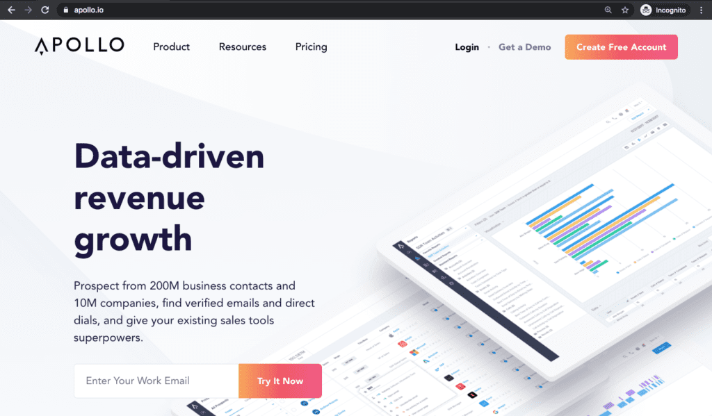
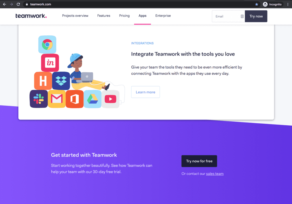
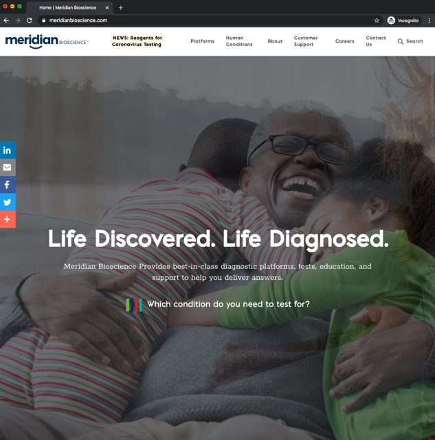
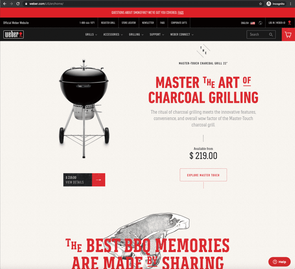
21. Build an Emotional Connection Through Images
Imagery provides the biggest influence on your website, enhancing your credibility and professionalism. Why? It’s what people see first and it brings forward an impression, whether that’s a good or a bad one. Don’t let the first impression be the last. Invest the resources in taking professional photography if at all possible.
If you have a salesforce that helps sell your products and services it’s imperative they’re on your website. People will want to know who they might be working with and it adds to the likeability on your website.
Images should be of high quality, demonstrate success, positive body language and vibe, and tell a story. Don’t have people’s backs facing the camera which comes off as cold and impersonal, and make sure images aren’t pixelated or stretched out. Don’t use cliche stock photography, like a bunch of businesspeople in suits looking at a conference room whiteboard, or a group of people jumping up and high fiving each other. Finally, avoid visual metaphors all together … just flat out bad!
Example of bad visual metaphors

Key Takeaways
22. Direct the User on What to Do Next
It’s not the user’s job to figure out what to do. It’s your job to tell them, which means you must understand their goals and needs. Prompt them with copy, visual cues, and clear calls-to-action. Subtlety isn’t your friend here—not every user is clued in on best practices, nor your thought process when designing their journey. Research shows people will simply leave your website sooner if there isn’t a call to action in place.
Key Takeaways
Need help with user experience design for websites?
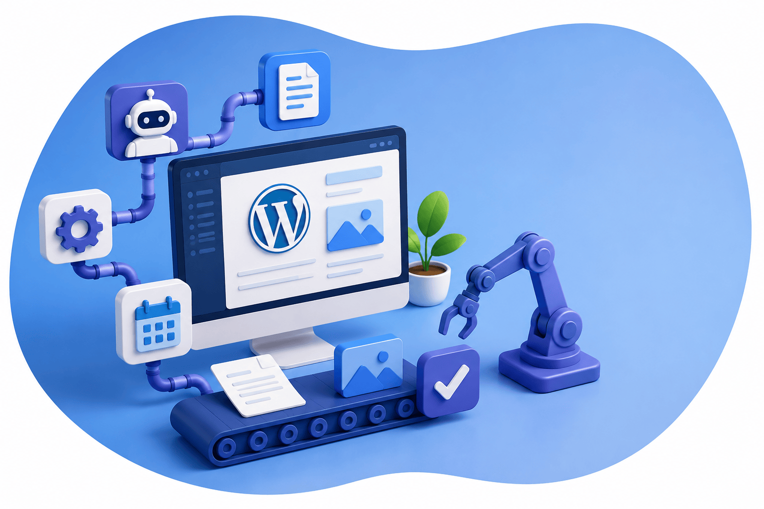
If you need a professional web design service with a strategic, user-centric perspective, we can help step you through our thorough process combined with our digital strategy services and custom WordPress development.

Download our UX Website Best Practices
We’ve already done the heavy lifting for you with our handy UX Website Best Practices PDF. It’s based off the lessons from this user experience design guide, and specific for website projects.
Download our UX Website Best Practices
We’ve already done the heavy lifting for you with our handy UX Website Best Practices PDF. It’s based off the lessons from this user experience design guide, and specific for website projects.