
How Do You Create Engaging and Effective Healthcare and Medical Web Design?
When building effective websites for healthcare providers, sensitivity, privacy, and accessibility are key. While you may have users of all sorts like providers and insurers, the vast majority will be prospective patients—ranging from concerned to panicked. Your site needs to be easy-to-use, mobile-friendly, and reassuring the whole way through. Read on to learn the best practices for healthcare website design that will help you book appointments and improve the lives of your patients.
Best Practices For Healthcare Website Design
Minimalist Design & Mobile Responsive
The majority of visitors use their phone to search for medical advice, practitioners, and insurance providers, so mobile responsiveness is essential. And when designing for tiny screens, minimalism is key so they don’t get overwhelmed. Help them find the information they are looking for without wasting too much time.
Functionality
Most healthcare websites don’t just have to look good, they have to do something. Whether it’s filtering a list of providers and locations, chatting with reception, booking appointments on a calendar, logging in to review your chart, or securely handling payments, everything needs to be in working order.
Accessibility
You need to keep users with disabilities in mind. Make sure your site is robust and operable by a range of user abilities, such as blind or low-vision users. It’s vital to adopt the Web Content Accessibility Guidelines (WCAG) when building your site. Allow the user to adjust text sizes, and accommodate text-to-speech—including on images and videos.
Approachable, Friendly, and Attractive Design
Using high quality photos and videos that project a friendly atmosphere at your organization along with approachable language is a must to set patients at ease and keep them on your site. You can also rely on illustrations, icons, GIFs, and tool tips to create a more relaxed mood, while also informing visitors of where to go and what to do.
Security & Privacy
HIPAA compliance is a requirement in healthcare—make sure your web developer is incorporating data protection policies that will keep you compliant.
Visual Design of Healthcare Websites
We’re visual creatures—make your first impression count through design elements that are vital to healthcare websites.
Clean and Comfortable Colors
Choosing calming, neutral colors for healthcare websites is a good option for more serious healthcare devices and services. Cheerful, bright colors are great for routine care, family medicine and pediatrics.
Bold and Clear Type
As a range of users will be accessing healthcare websites, it’s important to make the type and font clear, bold and large enough to be easy-to-read. With good contrast between text and background, patients will be able to read your content clearly.
Videos
Patient testimonials and stories, provider interviews, and even facility tour videos will increase the feeling of transparency and reduce the uncertainty some visitors may feel. If a picture’s worth a thousand words, a video’s worth a million.
High Quality Imagery
Investing in high quality, original imagery vs. stock photos helps give potential patients a real idea of your offerings. Instead of cheesy smiling faces of actors, show off unique photography of the real providers and locations on offer. This helps position your brand as genuine and approachable.
Large Buttons
Large buttons with colors entirely unique to them draws the attention of a user, not only alerting them that there’s an action to take, but also helping them navigate through your site. It’s particularly important for mobile design where screen real estate is limited.
Custom Brand & Descriptive Logo
To compete in the medical industry, healthcare organizations must stand out with memorable logos and non-generic brands, which accurately reflect their values, services, and appeal to their patients.
Healthcare Website UX (User Experience) Design
The user experience is about all the elements of your healthcare website that impact how a user feels, and what they understand they need to do. Here are some core elements to consider.
Load Time
There’s a simple rule in website performance—if it loads fast, users are happy, and if it loads slow, users will bounce. This is even more true on mobile devices, where users are accessing on the go and accustomed to instantaneous response, and even more true still in healthcare where users have medical questions and concerns they want addressed right away. Fast, lightweight sites are key to usability.
Easy & Clear Navigation
The top level navigation menu is the core way users get around your site. Ideally, it has as few items as possible, but if your healthcare organization does a lot of different things, then at the very least it needs to be well organized. One way is in a mega menu which provides prompts and visuals to help users find things. Other important elements include making it “sticky” so it follows users as they scroll, and written with obvious standard titles like “Services,” “About,” and “Contact.”
Main CTA
The main call to action or CTA should be present both in the top level navigation, and in the footer on every page. After all, if you want visitors to do something, it should be obvious anywhere they look. For a standard clinic, this might be “Book an Appointment”, for an insurer, it would be “Find a Plan,” and for medical device makers it might be “Talk to Sales.” And as stated before, make sure these are buttons with big text and a unique, bold color.
Online Scheduling
Being able to book an appointment is an essential part of the patient experience. Make sure that the experience is consistent and smooth even beyond the site—for example, the follow up and confirmation emails, and the ability of the patient to add the appointment to their calendar easily.
Provider Search
Users are conditioned to have near instantaneous searches, even on websites that aren’t Google. Make sure that your on-site search is able to detect the important keywords users look for, and serve results with representative images from the results to help them find their way, using structured data.
Online Bill Pay
Sending patients to a bunch of third party payment processing websites, prompting multiple logins and repeated form fills is a bad user experience. It also increases friction by making them question whether they’re stil on the same site, and safe putting their payment info in. Make it convenient and all in one place for the best UX.
FAQs
Sometimes users want fast information and searching through the site is not an option. Having a clearly labeled FAQ section (accessible in the top level navigation too) will allow a user to find an answer to their question as quickly as possible.
The Best Healthcare Website Designs
We have compiled a selection of some of the best website design ideas within the healthcare industry. Covering everything from effective landing page and home page design to creative elements these key medical website examples will give you a strong starting point when building custom designs and driving new leads.
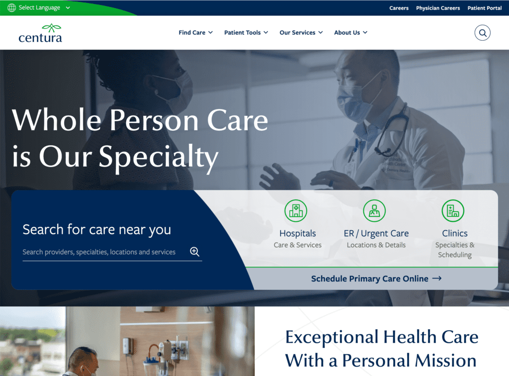
Centura Health
From a calming color pallete to original videos and photos, the Centura Health website makes a great first impression. Its top level navigation includes just a few key drop downs, easy to navigate. One clever detail is including a primary CTA “Find Care” in the bottom right corner of every page of the site, floating and always ready as the last place a visitor might look. The website also makes liberal use of animations for things like loading elements, transitioning between pages, and hovering over clickable objects, which helps the site feel fluid and gives hints as to where the user should go.
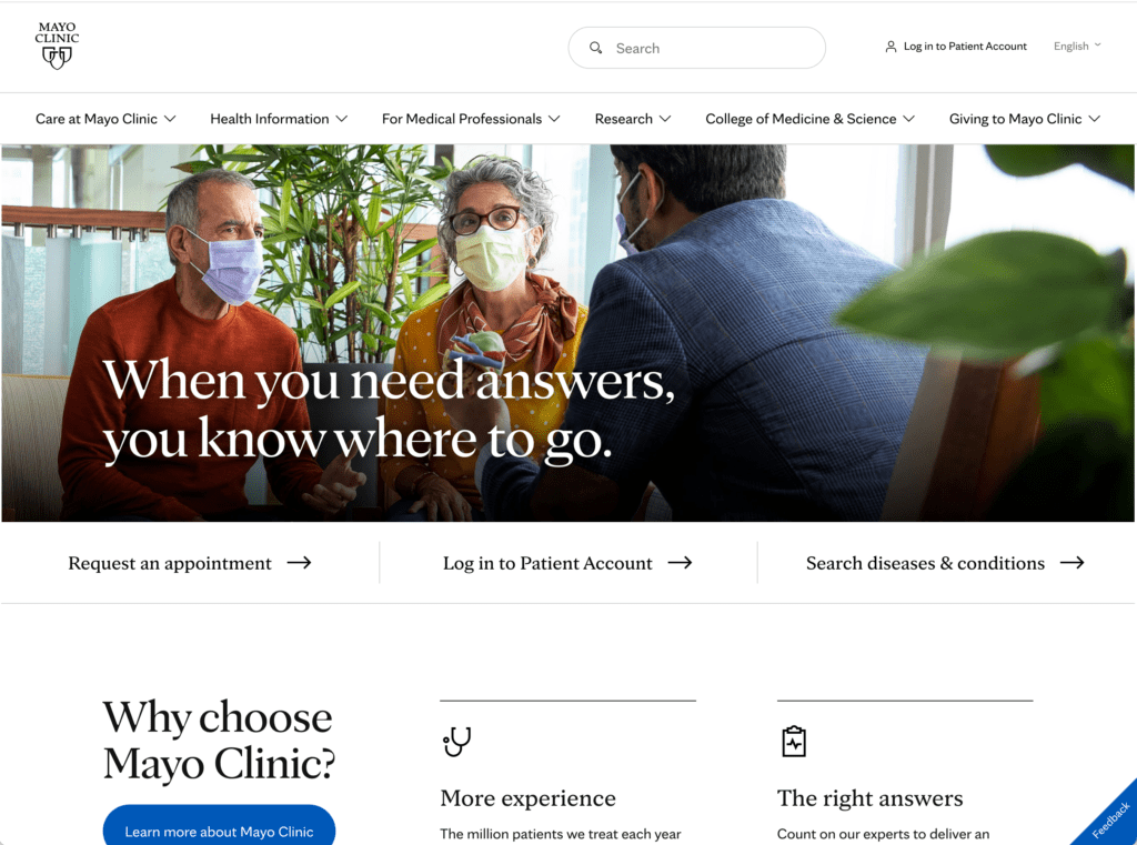
Mayo Clinic
As a top provider in the US and an institution in the industry, the Mayo Clinic’s website needs to match its prestige. Simple choices like a ton of negative (white) space helps the site breathe and makes it easy for visitors to identify important elements. A serif typeface gives it a more serious, venerable vibe. The site also elegantly balances its multiple needs, such as soliciting donations and funding, featuring its important research, and helping patients actively looking for care.
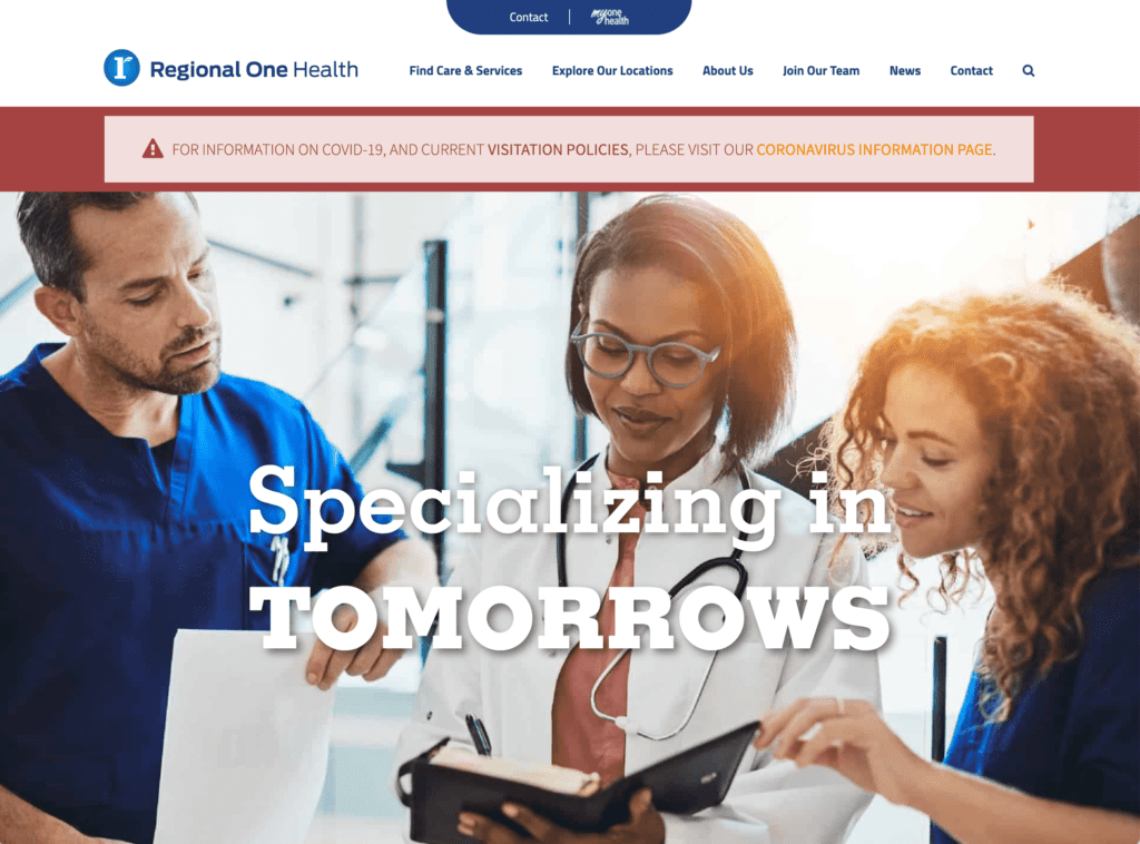
Regional One Health
The Regional One Health site uses a very simple color scheme and theme to good effect to showcase its content. It uses simple iconography to help lead users to a handful of paths, has a sticky navigation that keeps users able to get where they’re going, and a robust footer that helps both users and search bots find their way through the site.
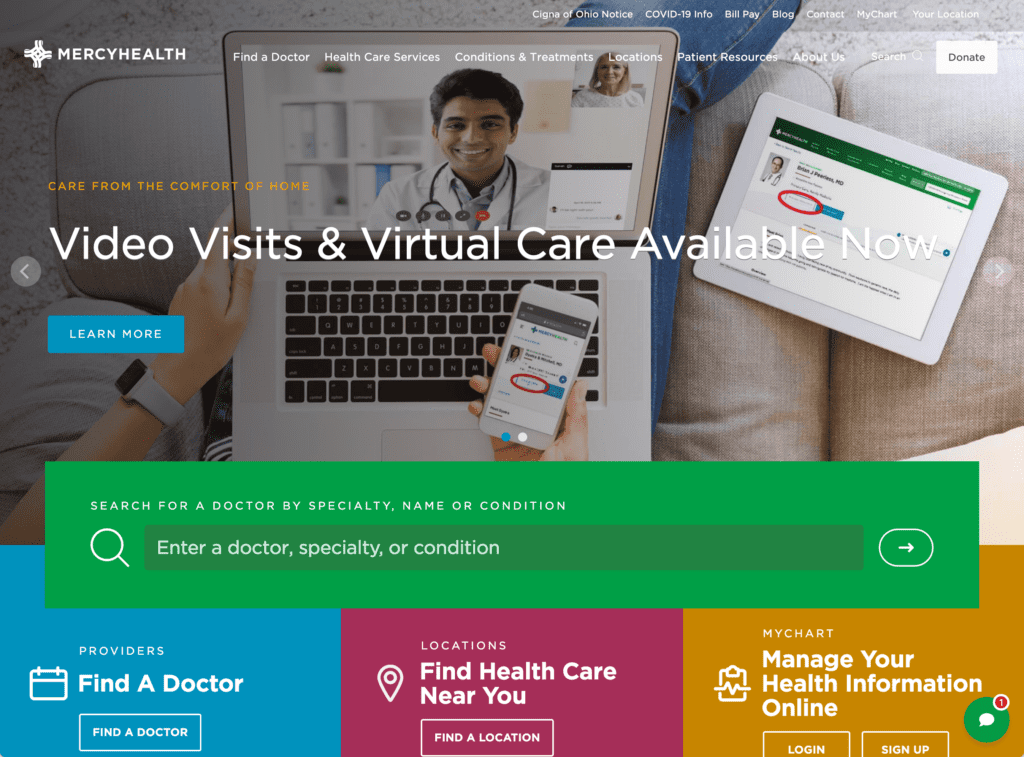
Mercy Health
Mercy Health’s site uses a handful of alternative navigation features, like a prominent search feature right below the hero image, which helps prompt users for what they can search for. A persistent chat bot also stays in the corner of the screen so visitors are never far from help.
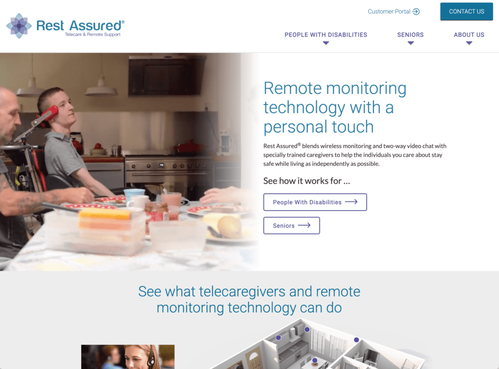
Rest Assured
As a medical device and service company, Rest Assured is built with the common features of a product marketing site. It uses original videography and interactive 3D renders to give a very clear idea of what the product is and does, and makes the site extremely simple to use for its target audience of seniors and people with disabilities.
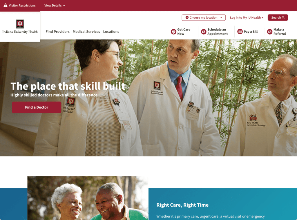
IU Health
Unique photography, large type, and simple layout help this site serve the Indiana University population. The site and its top level navigation are very geared towards action, with several unique and clear CTAs lined up, allowing users with different goals to quickly sort themselves and be on their way.
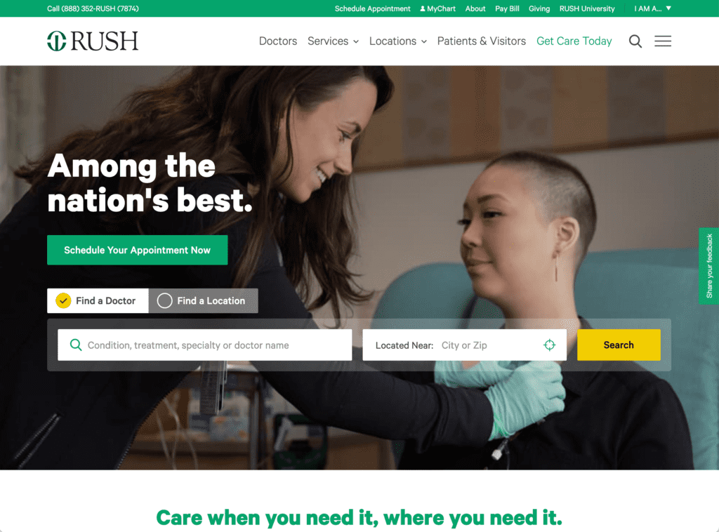
Rush Medical
Rush Medical’s site has a bold but easy to understand design, with short and punchy headlines displaying confidence and keeping the reader’s attention. Small amounts of lazy loading on different elements like sections, text and images help the site perform and be lightweight, while drawing the visitor’s eye throughout their journey. One useful feature that helps with UX is the “I am a” drop down menu that lets users self identify easily.
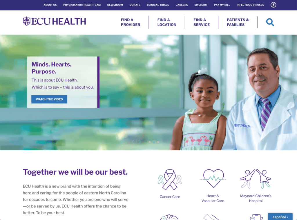
ECU Health
Original iconography, a small number of core navigation items, and a consistent color scheme help this site achieve a professional, easy-to-use design. A lot of the less important, secondary navigation is pushed into a small upper banner so that options are on the table but not cluttering the main nav. A comprehensive site search is never far away, too.
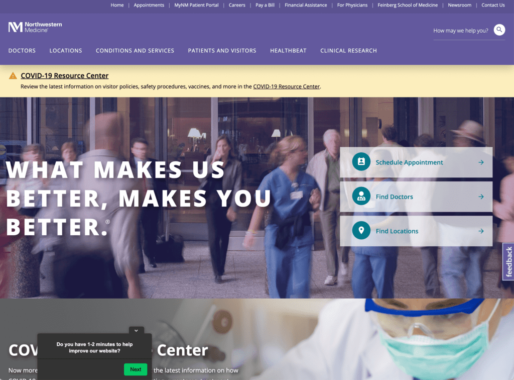
Northwestern Medicine
Northwestern Medicine’s site takes a lot of simple practices that make it work. The hero section on the homepage quickly sorts users into important relevant paths, with secondary paths in the top navigation to help users with more specialized needs, like accessing clinical research. Their blog and resource centers are easily searchable and provide information on tons of conditions, the services they offer, and updates, giving many different types of visitors the info they need, only when they need it.
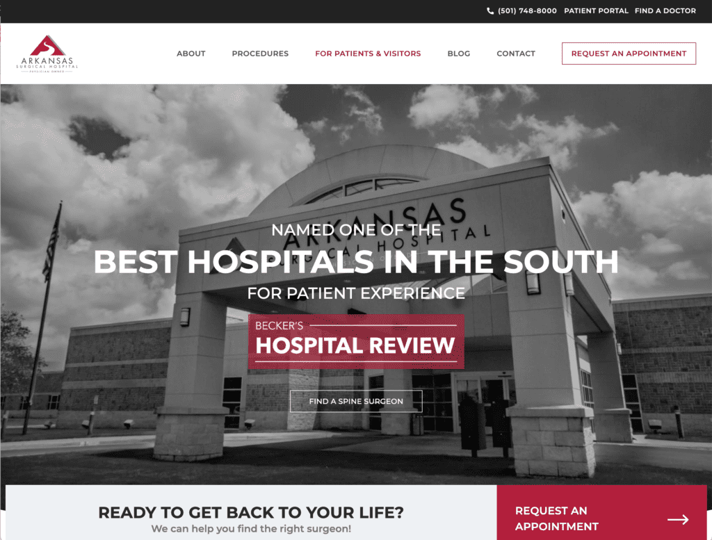
Arkansas Surgical Hospital
This website has a strong visual design, mostly black and white with a distinctive red color indicating the brand, and important points of interaction like it’s primary CTA, “Request an Appointment”. In a word, the design and layout is “clean.” You never feel overwhelmed or have a hard time figuring out what you’re supposed to do next.
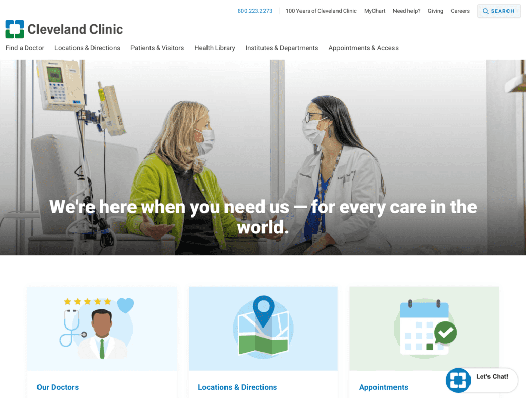
Cleveland Clinic
What this site lacks in visual flourishes, it makes up for in performance and simplicity. A consistent illustration and icon look helps the brand shine through, and easily helps visitors of all types move throughout the website. They also have a chat bot and large resource section to help users find their way and understand more about what the clinic does.
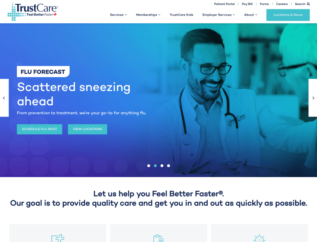
Trust Care
The use of navy for framing and light blue for interactivity helps guide users through this site, creating a feeling of depth without adding too much visual clutter. A handful of navigation options help guide users, with a key CTA of “Locations and Hours” to set patients up in the right direction.
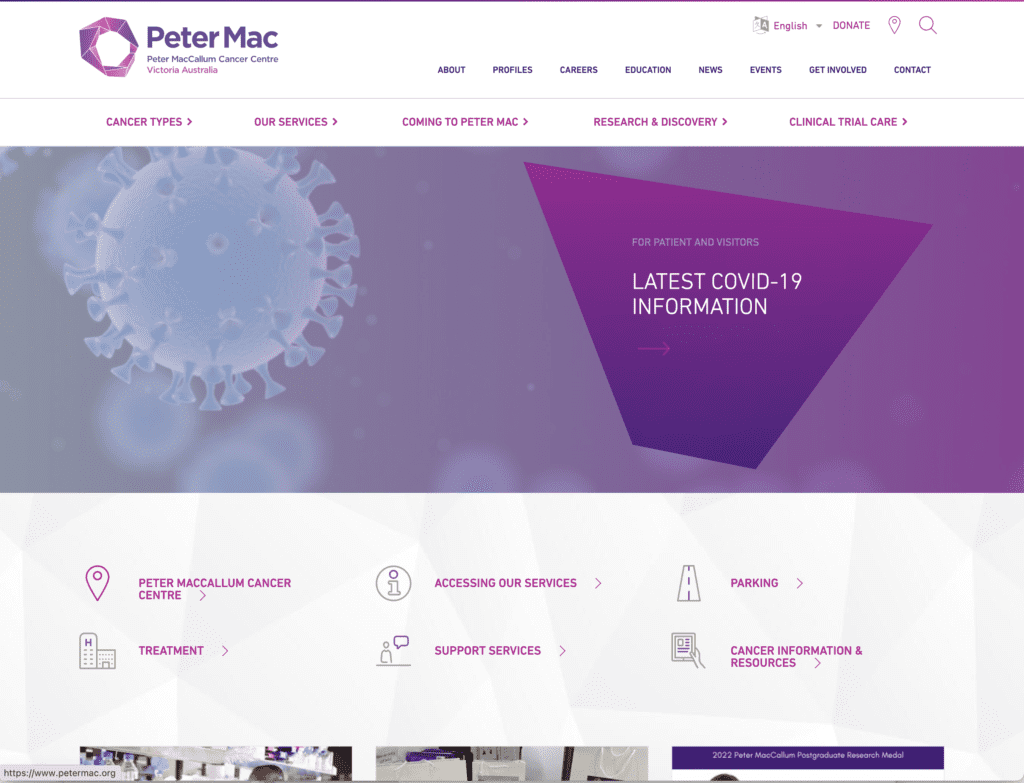
PeterMac
This site is a specialized cancer center which provides extensive resources and blog content for users. This is a high performing website with responsive design and unique contrasting colors that do not compete with the information provided.
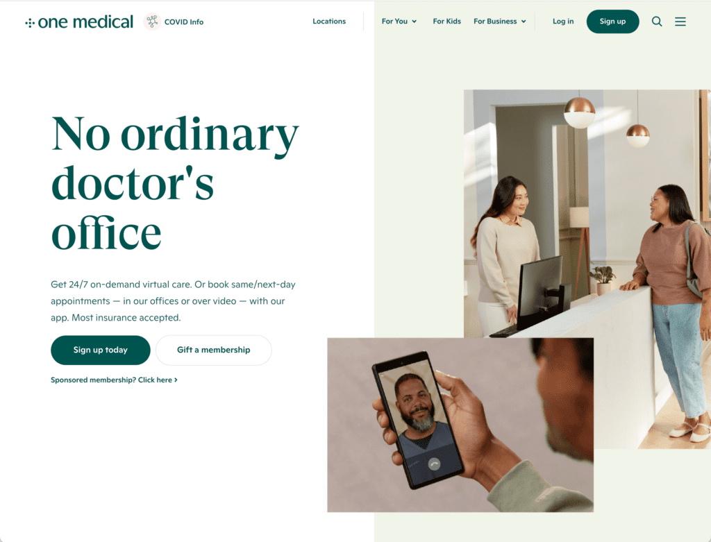
One Medical
One Medical’s site is modern and snappy, with lazy loading and a well-designed aesthetic when it comes to light use of greens and natural tones. Minimalist animation flows throughout the site, which is also punctuated by strong original photography and icons in an illustration style. Everything drives towards the core CTA of signing up for this interesting alternative to standard clinics. Because it’s different from other clinics, a lot of sections are devoted to “your experience” and “what to expect,” correctly anticipating visitors’ needs.
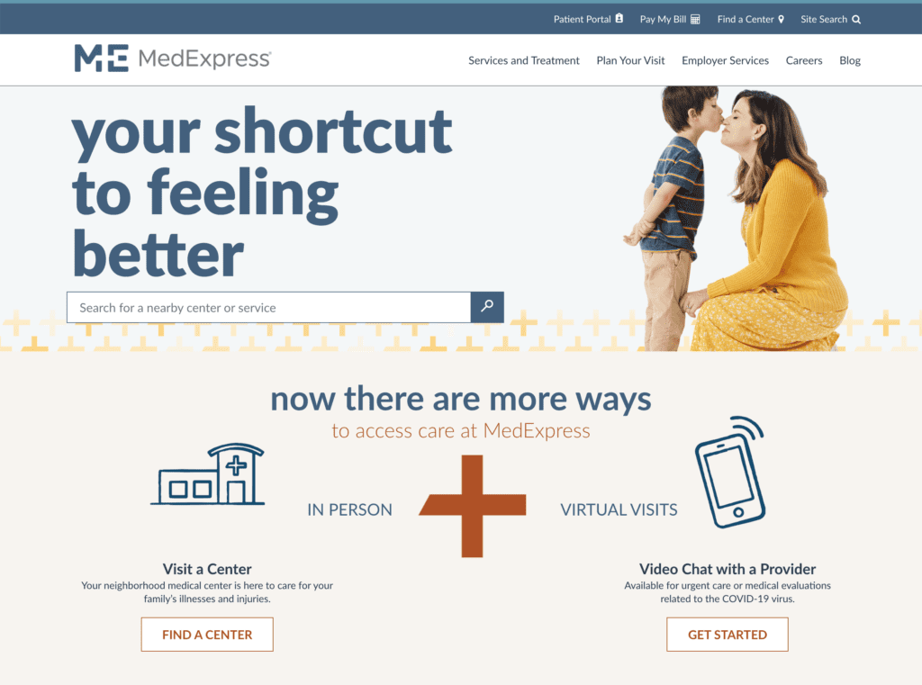
MedExpress
“Skip the ER and save big.” This headline kicks off a strong, patient-centered experience. The site does a good job of balancing a wide variety of services and information they need to impart, with keeping the site relatively clutter-free and easy to navigate.
Successful Website Design for Healthcare Providers
Healthcare websites serve as more than just a digital front door—it’s a critical tool for providing immediate, reliable assistance to those in need. Whether it’s simplifying the appointment booking process, ensuring mobile responsiveness, or addressing accessibility needs, each design element should contribute to a seamless and reassuring user experience. As healthcare professionals, you’re in the business of improving lives; your medical website should reflect this mission by prioritizing user-focused design, robust functionality, and, above all, trust. Keep these best practices in mind to build a healthcare website that not only attracts visitors but also turns them into satisfied, well-informed patients.