Gold Medal B2B Website Design: Best Practices and Examples to Dominate Your Vertical

by Matt Sheeks
Gold Medal B2B Website Design: Best Practices and Examples to Dominate Your Vertical

by Matt Sheeks
How can we compare the difficulty and patience required for successful B2B website design to the sporting world?
As a leading web design agency in Seattle, we will explain using clients’ examples…
One example is when Olympic Gold Medalist and 1-hour record holder Chris Boardman shocked the cycling world with the following remark:
“I don’t particularly enjoy cycling. It hurts and it’s hard.”
This stung the majority of the cycling community, who genuinely enjoy riding their bikes. They clearly hadn’t learned what it really takes to excel like Boardman.
But there’s a lesson about B2B web design to be learned here:
- If someone says B2B web design is easy, they’re probably trying to scam you. Internet marketers abound who love to discount the time, effort, and skill level needed to master web design. However, they do this more in an effort to make a sale than to explain reality.
- Successful B2B web design requires intense research and planning…and only then, execution. This is the web design equivalent of training. In fact, most of the work you do in order to create a high-performing B2B website will occur behind the scenes and off the site entirely, much like how the training of top-level athletes receives much less attention and fanfare than the competitions themselves.
- Successful B2B website design requires a wide-range of skills including content strategy, content creation, web design, web development, and specific skills needed for whatever CMS you choose. In other words, it’s hard!
In fact, the most painful B2B web design experience is when you launch a website only to realize that it doesn’t perform. Then you have to re-do the web design process all over again.
Let’s make sure this doesn’t happen to you or your company!
Therefore, in this complete gold-medal guide on B2B website design, we’re going to share with you:
In this guide we’ll cover:
- How to plan your B2B website design using a content strategy and research
- B2B web design practices to give your site winning content, usability, and design
- What differentiates B2B web design from B2C web design
- Ecommerce B2B website design tips to make sure you accomplish your B2B business goals
- B2B web development tips to build your site with the functionality, speed, and security that will keep your site running smoothly and reduce the daily anxiety that something catastrophic might happen to your site
- How to pick the right B2B web design agency
- How to Submit a B2B Web Design request for proposal (RFP)
Let’s begin!
1. Planning Your Customer-Focused B2B Website Design
focus on a “company-centric” website
When it comes to B2B website design, far too many companies and organizations are developing “company-centric” websites.
What do we mean by that?
- The website’s navigation is designed around the company structure and industry-specific language that their target audience doesn’t understand.
- The website’s headlines are incomprehensible to a first-time visitor.
- The website content speaks to how great the company is over and above the competition, but fails to address the objections and concerns of their target audience.
- The website is “over-designed” and some of the fancy features get in the way of the user experience, especially on mobile devices.
- The website has greedy forms that ask for too much information, while promising little of value.
You’ve probably seen plenty of websites like this.
But you’re going to build your B2B website differently, right?
Instead of the above, you’re going to want to save the narcissism for your company happy hour (or in our case, the ski slopes) and develop a “customer-centric” website instead.
In their book, “Making Websites Win,” authors Dr. Karl Blanks and Ben Jesson make the following claim about customer-centric websites:
“These companies, the most successful websites, focus on their customers. Customer-centric design was – and still is – surprisingly rare. The websites look nothing like the ones you see in theme galleries. Customers like them, they visit them often, and they spend a lot. Customer-centric, customer-optimized websites are winning.”
It All Starts with a B2B Content Strategy
So how do you create a customer-centric website that wins?
Whether you’re planning a B2B website build or an ongoing B2B marketing campaign, you need what is called a content strategy. A content strategy is a planning tool that will help you align your content to serve your target audience while meeting your business goals at the same time. A content strategy provides the foundation for your website build and defines how to measure success.
So what are the “must-haves” in a B2B web design strategy?
- Website Goals – Here you will define what success for your brand-new website or redesign will look like. You can categorize your goals into (a) traffic goals, (b) content goals, (c) design and user-experience goals, and (d) conversion goals. If you are doing a redesign, think carefully about the specific elements of the previous website you would like to improve. If you have a website that is live, you can start creating a FAQ list of questions, issues, and challenges that current website visitors are facing.
Here’s an example set of goals from a recent website strategy done by Sayenko Design:
Website Objective
The primary marketing goals for the PSC website are eight-fold:
- Serve as a hub for a new deliberate approach to marketing
- Reinforce PSC’s brand credibility and increase brand awareness
- Generate sales and recruiting leads using respective contact forms
- Track lead activity with integrations to social media
- Host case studies and manage an upgraded Careers portal
- Support growth of 15% per year over the next 5 years
- Increase the ratio of premium consultancy sales vs. labor supply
- Optimize for mobile devices
Competitor Research – Competitor research may be used to outpace your current competitors; but more often than not, you can examine your competitor’s websites with a view to serve your customers better. (Remember, we’re talking about “customer-centric” websites here). Oftentimes you competitors will have learned from their own website visitors and published a piece of content that you hadn’t thought of. You can also use a competitor analysis to think of things you’d like to avoid, or gaps in your competitor’s content strategy. There are a lot of bad websites out there, after all.
Persona Development – Here you will want to segment your target users into various fictitious personas that are based on actual research. This will help you get into the minds of your future visitors and understand how to best communicate with them, empathize with them, and discover new types of content and modifications you’ll need to make to your website.
There are many excellent how-to articles on persona development, including ones from Hubspot and Copyblogger, so we won’t belabor every single point here. It is important to point out, however, that your personas need to be based on real people, conversations, and analytics. You’ll need to conduct one-on-one interviews with existing clients, consult your Google Analytics dashboard, and speak to your best salespeople in order to really understand the needs of your website users.
For B2B website redesigns: If you have an existing site, you can install more sophisticated software to learn even more about your target audience. A good place to start is by installing live chat so you can learn the questions and concerns of your audience directly. Other excellent tools to consider would be user-heatmap and user-recording software such as Crazy Egg or Zoho Pagesense.
Pro Tip: We highly recommend that you conduct interviews with what Conversion Rate Experts has coined, “VOC Aggregators.” VOC stands for “Voice of the Customer.” A VOC aggregator may be (1) Your best salesperson, (2) An excellent customer-service rep, or (3) a front office person. Basically, they need to be someone who speaks directly to your customers often. This person will have a keen perspective on your customer’s needs as it relates to your website, and can offer a fresh perspective on what to do in order to create, modify, or adjust your content and design experience.
These interviews are not only helpful for developing your target user profiles, or personas, they are also vital in creating your content types.
SEO Research – SEO research is the process of determining how often certain keywords are typed or spoken into a search engine. SEO research is valuable because it not only provides you with ideas for which keywords to include on your website, thereby increasing your search engine rankings; it is also a form of market research, giving you a sense of demand for certain products and services which lay behind the keyword phrase. The information gathered from your SEO research influences the rest of your content strategy, flowing to your personas and content types.
When you conduct SEO keyword research for your website, you’ll want to segment your keywords into (a) informational, and (b) transactional keywords. The transactional keywords will be best to target on your homepage and product pages, while the informational keywords are best to target with informational content pieces such as blog posts, resource pages, podcasts, and videos.
Once you have your transactional keywords, you’ll want to group them even further by determining which page of your site you’d like to target each keyword.
Let’s say you’re a roofing company located in the Seattle area.
You’ve conducted SEO research and decided that “ship repair Seattle” and “ship painting Seattle” are both good fits for your business, although the gutter repair is more of a side service
You’d likely want to target “ship repair Seattle” on your homepage and “ship painting Seattle” on a separate service page.
This means that you’d want to target “ship repair Seattle” in your SEO page title, meta description, body copy, and likely your headings as well.
For a more thorough explanation of how to conduct SEO research, check out the Moz Beginner’s Guide to SEO.
It takes serious thought and effort in order to prioritize exactly which keywords to target on your site. If you’re not confident in your SEO research abilities, you may want to enlist the help of an SEO expert such as Sayenko Design.
- Content Types – Prior to even beginning to write content or designing your B2B site, you’ll want to outline what types of content are needed on your site. You can include a short description or bullet points of what content will appear on each page of your new site, what personas the content will appeal to, and where it falls within the buyer’s journey.
- Conversion Goals – A conversion goal refers to a specific action you’d like your website visitors to take. This could be to fill out a contact form, watch a video for a certain length of time, or download a free guide in exchange for their email address.
It goes without saying that you’ll want to create conversion goals that are in line with your business goals and sales process. However, the key to outlining your conversion goals is how you plan to measure them. For example, if your goal is to increase contact form submissions, you’ll want to send the visitors who complete the form to a thank you page. This will allow you to measure in your analytics tool how many users made it through your funnel.
Here are some common conversion goals we see in B2B:
- Sign ups for a product demo
- Submissions to schedule a consultation or strategy call
- Submissions to request a quote
- RFP submissions
- White Paper Downloads
- Product Comparison Downloads
- Sitemap – A sitemap is a visual of your site architecture and hierarchy. Here you can plan how all your pages fit together and which ones to prioritize. Creating your sitemap is a good opportunity to think of what will be the most intuitive route for your target personas to take to navigate through your website.

Example: Sayenko design was tasked with redesigning the Power Systems Consulting website, an independent consulting and engineering company for utilities and energy. The Power Systems Consulting Website successfully segmented website users into different persona groups, then mapped new content to satisfy the needs of each type of user. This resulted in a 224% increase in organic traffic and a 250% increase in keyword rankings. Learn more.
Redesign-Specific Planning for B2B Websites
Does your company/organization have an existing B2B website? If so, you have a treasure trove of data at your fingertips regarding your would-be target audience.
How do you tap into this potential?
Some companies are ashamed of their current site and just want something better than the last one. Instead of simply discarding your current site, you can be accumulating information using various techniques.
Again, our friends at Conversion Rate Experts are insightful; they have developed a framework known as DiPS, which stands for “Diagnose, Problem, Solution.”
This involves using research to determine where visitors are getting hung up, developing a hypothesis on why the site or page is underperforming, then creating a solution that is specific to the issues your users are facing.
One test that conversion-rate optimization specialists love to run is known as an “A/B” test, where one version of a page is run against another in order to test small variations. However, “A/B” tests are impractical for low-traffic websites because the tests often do not reach statistical significance. Instead, we recommend using a few tools that are more qualitative in nature:
Live Chat: install live chat so you can learn the questions and concerns of your audience directly.
Heat Mapping and User-Recording: With heat mapping and user-recording software installed on your site, you can see exactly where users are getting hung up, where the dropoff points are on your site, and where your designs could have been better. Excellent tools exist for this such as Crazy Egg or Zoho Pagesense.
Surveys: Where the best spying tools fail, consider simply asking directly instead. The key to a good survey is to not ask for too much information at once. You can simply ask if the page was helpful or not and what additional information users would like to have seen.
With actual qualitative research in hand, you’ll be in a much better position to build out your website content, user-flow, sitemap, and designs.
2. B2B Web Design Best Practices
Showcase educational content and demonstrate expertise
Step 1. Learn from the B2B Copywriting Masters
Now that you’ve planned your B2B website design and even developed some sweet personas to keep you in the frame of mind of your reader, it’s time to start creating content. There are loads of successful copywriting formulas that you can use to write your content, and we’ll suggest three you can use here.
- Problem-Solution. You’ve probably seen plenty of content on the internet that is boring and stiff; the key to avoiding this and instead grabbing your visitor’s attention is by resonating with the problems they are facing, then explaining how your product or service happily aims to solve these problems.
- The Business Casual Copywriting Formula. Joel Klettke from Business Casual Copywriting expands on the simplicity of problem-solution structured content with the framework he uses to write highly-converting SaaS copy for some of the world’s top Saas brands.
In your copy, you should answer the following questions:
- What is it?
- Who’s it for?
- Why should I care?
- How does it work?
- Why should I trust you?
- What’s next?
According to Joel, at the beginning of your page you should typically answer, “Why should I care?,” “what is it?” and “who’s it for?” In the body content, you should cover “how does it work?”, “how will it improve my life?”, and “why should I trust you?”
Towards the bottom, your copy and CTA should answer “what’s next?.”
Learn more about this technique over at Business Casual Copywriting.
The PASTOR Formula from Ray Edwards. Direct-Response Copywriter Ray Edwards has synthesized the best components of high-converting sales pages and sales letters from the “Mad-Men” era all the way up to today’s web-based marketing and advertising. The acronym he developed is known as the P-A-S-T-O-R method. This is a way to shepherd your website visitors along in order for them to make a buying decision (or non-buying decision) that is in their best interest.
You can find a full discussion of the PASTOR method on the Smart Passive Income Podcast or at rayedwards.com.
Remember, even if you wrote some award-winning web copy, you still need to make this content accessible and easy to find for your website visitors. You’ll want to refer back to your content strategy – especially your sitemap and user-flow diagrams – to make sure all the content flows nicely together and is intuitive for someone that isn’t accustomed to your company, industry, or product/service offerings.
Once you actually begin designing your site, you’ll want to break up your content into smaller, bite sized chunks for people with different reading styles (i.e. readers vs scanners). Blurbs, icons, bullets, numbers, lists, and accordions are all ways to accomplish this.
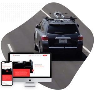
Example: Microvision develops Automotive Lidar, and the homepage uses storytelling and short videos to paint the picture on what makes their solution a superior choice for automotive manufacturers. Sayenko design built the Microvision website pages in a way for casual users to be able to scan the website and get a high-level idea of what Microvision is all about. For website users who want to dive deeper, they can click on expandable elements, watch videos, and visit supporting pages.
Step 2. Create a Descriptive Main Menu and a Useable Header
Menus and navigation can be tough because there often isn’t enough room to really explain why a user should go there. Most internet users are comfortable with traditional horizontal navigation; however, you are typically limited to one or two words to describe what the page is about. This is also confounded by the fact that many users will be unable to grasp industry-specific language that may be necessary to label your website pages.
So what do you do?
We recommend a few different strategies which can be combined or used in isolation:
- Simplify your main menu navigation. If you include only the most important pages in your top-level navigation it’s harder for users to get lost in a labyrinth of choices.
- Example: World-renowned digital marketer Neil Patel has zero menu items in his main navigation, despite having thousands of pages. Instead, you simply click a button further down on the page. Once you get to the page you are looking for you can filter down to find the topics you want, and if you still cannot find what you are looking for, you can find some additional helpful pages within the footer menu. This website is a good example that not every page needs to be in your main navigation.
- Use subtitles. If you use a traditional menu, it’s possible to add a secondary heading immediately under the primary menu item. This can give more context on what the page is about.
- Use a mega menu or full-page menu. The last option entails creating a more visual, non-traditional menu that may take over most of the user’s screen. Here you can have more design and content control, and can explain in 1 or 2 short phrases what the page is about. If your B2B site has a large number or products or services, 8 or more, you should strongly consider a mega menu. This will allow you to use visuals to highlight key services/products, resources, or case studies. You can even embed content like images or video into your menu, making it even more engaging.
- Example: The Sayenko Design website uses an attractive mega-menu to draw users into the resources or services they need.
Mobile Menus
There is a good change that some of your users will be on mobile devices. Even if many of your B2B users are on desktop the majority of the time, they may also access your website using mobile or tablet at other points in their investigative journey. Therefore, your mobile menu can’t be an afterthought. Here are a couple mobile menu tips:
- Consider labeling your “hamburger” menu for older audiences. Some more-seasoned web users don’t understand that three horizontal bars indicate a clickable menu, so simply labeling it with the words “menu” to the left or right can help.
- Make sure your mobile menu is highly visible and clickable for users with fat thumbs (ahem…we mean, larger digits).
- Double check to make sure you didn’t exclude anything critical on your mobile menu. For example, there may be buttons or links that are located in an obvious location on desktop, but aren’t as visible on mobile because they are not specifically a menu item (like a CTA button).
- Make sure no popup or other interstitial (like your cookie notice) interferes with the mobile menu. We see this happening even on larger websites all the time! If you do have popups on your site, double check that the “close” button is easy to find on mobile.
Step 3. Use a Benefit-Driven Initial Headline.
In web design speak, we often refer to the area directly under the header as the “hero” area. On the homepage, visitors should be able to understand who you are and what you do in under 5 seconds just by reading the content in the hero. On your other pages, the headline within the hero should explain the benefit to the user of whatever the page is about.
Step 4. Include Your Unique Value Proposition
If you have an introductory paragraph on your B2B site that reads, “we’ve been in business for 35 years and are proud to serve bla bla bla…” you’ll want to swap out your drone and drivel introduction for a benefit-driven unique value proposition instead.
According to Unbounce, “your UVP is a clear statement that describes the benefit of your offer, how you solve your customer’s needs and what distinguishes you from the competition.”
You’ll want to feature your UVP early on in your homepage, and perhaps even on your about page. This will hook your visitors into your site once they understand what makes you different and how you can help them.
Step 5. Include Trust and Credibility
Building trust and credibility boils down to a lot more than simply tossing in some testimonials on your key pages, especially for B2B. You’ll need to think of what sources will seem authoritative for your industry and are recognizable to your target audience. In some cases this could be a list of clients with logos, while others could be a review with an accompanying link to an authoritative review site like Clutch.co, Trustpilot, or Capterra. You could even include a logo indicating you’ve completed a certain course or achieved a certain certification.
So where should you include your trust, credibility and social proof elements?
Definitely not on a separate “testimonials” page. Andy Crestodina from Orbit Media studios explains, “These pages rarely get visited. Just check your Analytics.”
Instead, you’ll want to intersperse these authority-building elements within your main selling pages, like your homepage, service pages, and landing pages.
But there’s one more mega-opportunity for adding credibility to your B2B websites, which is to add portfolio pages to your website, showcasing successful work and projects you have completed. We discuss this more in our B2B vs B2C Web Design Distinctives section below.

https://www.sayenkodesign.com/work/aviation-b2b-web-design/
Step 6. Anticipate Objections
Potential customers will often have many ideas in their mind about why your product/service might work in theory, or why it may work for someone else but not for them. Since your website should be your 24/7 robotic salesperson, it should be able to answer the primary objections your target audience may have.
So what’s an obvious way to answer these questions on a website without sounding pushy or salesy?
Use a FAQ section, of course!
Within your frequently asked questions, you can add answers to the most common objections that you or your sales team have encountered. Try to turn each negative into a positive. You’d be amazed at how answering a simple additional question about a feature of your product or service can tip someone over the edge from simply browsing your website to being ready to fill out a contact form, schedule a demo, or contact sales for a consultation.
Step 7. Include Tailor-Made CTAs for each stage of the Buyer’s Journey
Call-to-Action content and design elements in B2B can be tricky. On the one hand, you may only work with a select handful of optimum clients and don’t want to answer calls and respond to emails for all comers. This might lead you to want to weed out leads who are not serious by using longer forms that qualify your leads. But B2B websites have another problem, which is that their website users are often conducting heavy research even before choosing to reach out and become a lead. You’ll want to appeal to the heavy researchers as these individuals may end up becoming your best clients…
…But they’re not ready to contact you yet through a traditional contact form submission or phone call.
So what do you do, besides having already given them loads of compelling website content about why they should choose you?
We suggest you go up the sales funnel slightly and use CTAs and content to target users who are in the “consideration” or “evaluation” stage of the buyer’s journey. Consider this as a “leaving piece” for all the researchers out there.
Examples:
- Downloadable White Papers
- Process Documents
- Templates
- Spec Sheets
- Comparison Tables between You and Your Competitors
- Buyer’s Guide
Of course, you’ll want to make sure you snag your visitor’s email address in exchange for the additional content you provide them.
3. B2B vs B2C Web Design Distinctives
Consider the longer sales cycle
How do B2B sites differ in their strategy and overall makeup from a B2C site? In general, you will want less flash and flare as compared to B2C, and instead should display more educational content, resources, and in-depth case studies to accommodate a longer sales cycle.
We have compiled a list of B2B web design factors to take a closer look at:
-
- About Pages: In Business-to-Business, your about page will be more important in building trust than in B2C. Your visitors may end up working directly with the people on this page, so it is important to reassure them with some genuine, helpful information about yourself. Discuss what inspired you to get into your line of work and how you can provide solutions for your target audience. B2C website visitors will be less concerned with the people who make up the company as, generally speaking, they are mostly concerned with the product itself.
- Portfolio/ Case Study Pages: Portfolio pages are critical for B2B sites as they are an obvious way to show your target audience that you have practical, hands-on experience solving problems and providing solutions for companies similar to their own. You’ll also be able to give your target audience a clear, tangible picture of what sort of results they might experience if they choose to work with you.
- Custom Photography: B2B website owners should invest in custom, original photography of their team, their company at work, as well as custom graphics that are specific to their unique working process. Some stock photography, such as a landscape photo used as a background image, is okay to use occasionally, but stock photos of people are a big no-no. Website visitors can recognize stock photography quickly; trying to pass off stock photos or video as yourselves will only detract from your credibility.
- Design Emphasis: If you’re new to the B2B web design, you may not realize that there are specific differences in design emphasis that will work in your favor on a B2B website, as compared to B2C web design. Here we have compiled some styling differences between B2B and B2C web design.
| B2B | B2C | |
|---|---|---|
| Color | Darker Blues are considered the predominant professional color for B2B sites. In general, color schemes use muted tones that are more conservative in nature. Limited color palettes are generally used - two to three colors. | Depending on the industry, consider using a bright color scheme, especially for SaaS/ technology companies. |
| Typography | Stay professional and conservative when speaking to leadership, C-level execs, managers, decision-makers, and employees by avoiding oversized fonts. In general B2B is more content-heavy, thus the use of attention-grabbing oversized fonts isn’t practical. | Lifestyle brands and products often use bold, oversized fonts built to tug on the heartstrings for an emotional response. |
| Photography | Show off your team, the people that work behind the company. Your audience wants to know who they're going to be working with, so provide headshots. Build up the likability with professional photos in your work environment. Depict work with a sense of enthusiasm. Always demonstrate success, and have a positive body language and vibe. | The team behind the brand isn’t as critical because people just want a good product. They're investing in products, not people. |
| Web Design | Use conservative layouts and traditional content blocks to maintain a business professional look and feel. | Feel free to use unique, off-the-grid layouts, icons and infographic elements. |
| Animation | Keep animations subtle and to a minimum, unless it enhances retention. | Create a WOW factor with bold animations. |
| Lead Generation/ Purchase Process | B2B usually focuses on lead generation. People are more afraid to make a decision because it can affect their entire team or company. Risk aversion and fear are two emotions that are typically associated with B2B purchases. One bad experience can lead to a bad reputation, an unhappy team, and could possibly affect other clients’ decisions through reviews and testimonials. | B2C purchases are routinely associated with emotions. It’s a simpler process in a much shorter time frame. |
4. B2B Ecommerce Web Design Tips
Ecommerce isn’t always the right fit for B2B
The rules for B2B ecommerce website design will be completely different from those of B2C sites. You will want to be strategic about how you use ecommerce on your B2B site, rather than simply assuming that what works for B2C will work for B2B.
For example, do you really want someone to be able to directly check out on your site for a $5-50k service when you have never met them or vetted them as a good potential client? Probably not. So, including a “normal” checkout process on your B2B site is likely to be a bad idea.
Or, perhaps your company is in the middle of the supply chain and you do want customers to be able to purchase more inventory whenever they like. In this case you may want to allow for visitors to checkout only if they have an official login to the backend of your site.
B2B Merchandise Ecommerce
Some B2B sites make the mistake of thinking they will look bigger and more important by providing company merchandise for sale, right on their primary website. Instead, as a B2B website owner be sure to avoid distracting from your primary CTAs (which is likely to be lead gen) with merchandise for sale. Think about breaking up your merchandise e-commerce onto a sub-domain or internal ecommerce site, which will then streamline the user-experience on both sites. Yes, merch makes you look cool, but you don’t want to distract someone from becoming a $50k/yr client just so you can hoc them a $15 trucker hat.
B2B Ecommerce vs B2B Customer Portal
If you have regular invoices with fluctuating pricing and custom proposals, you may be looking for a customer portal as opposed to traditional e-commerce. Using customer portal software will give you more control over who can and cannot check out, what prices you set, and give you the ability to provide supporting documents like proposals, invoices, contracts with e-sign capability, etc.
Customer portal software can help you speed up your internal processes by eliminating a certain amount of back-office work. At the same time, it will give your customers some helpful tools on their end to review contracts, sign documents, pay invoices, review their past payments, and submit support tickets. If you’re looking for a customer portal software recommendation, we like Suitedash. If you want a customer portal that you can manage on your own server, check out Perfex CRM. For a free customer portal that is focused on subscriptions and invoices, you’ll definitely want to give Zoho Invoice a try.
5. B2B Web Development Tips

Now that you’ve strategized your site, written high-converting copy, laid out your information architecture, and designed your site – you’re all done, right?
Well, not really. There is still the pesky problem of the underlying software and technology to keep the whole website afloat and running smoothly.
But never fear, we’ve included several B2B web development tips to make your life just a little easier.
- Reverse-Engineer your site given your current tech stack. Think about the tools and software that you already use for running your business. What do you use for accounting? Checkout? Do you already use Square? Quickbooks? Do you use Shipstation? Which CRM do you use?
Once you have these questions answered, look for website software that directly integrates with these tools, or is even furnished directly by the software provider itself. For example, Sayenko Design prefers to use Gravity Forms (a WordPress plugin) for contact forms as it provides a huge number of integrations with popular CRMs, payment processors and other types of software.
- Make the transition between your website and your sales process and CRM flawless. Think of as many ways to cut back on manual entry within your CRM, and instead find ways to gather information and perform tasks automatically. This will cut back on manual work from your sales team and therefore reduce the possibility of error. Usually this process is simple and unsexy, but it does take some planning.
For example, does your first meeting with a prospect involve a zoom link, but you’re always creating the link manually, then adding it into your calendar invites? Make sure to integrate Zoom into your calendar software (which should be tied to your CRM, if not directly part of it) so this task is performed automatically.
Does your CRM contact form ask for first name, last name, and email only, when in reality you need to get someone’s phone number immediately? Add it as a new field in your form!
- Focus on Site Speed. If you want to look professional for your B2B audience, you’re going to need your site to load quickly. There are a few silver bullet tips here that will help you make strides in reducing your load times.
- Get good website hosting. Not all website hosting is created equal, and the budget hosting options like to bog down their servers with too many sites and too few resources. We like WP Engine here at Sayenko Design for Business WordPress hosting.
- Reduce/Minimize the number of requests on your site.
- Resize and compress your images.
- Don’t bog down your website with plugins you don’t need.
- If applicable, use a reputable caching plugin.
- Focus on Website Security. Nothing kills your trust and credibility like a broken or hacked website. Here are some important items that will quickly improve your website security,
- Get Good Website Hosting. Again, website security first begins with quality website hosting. If you run WordPress, you may not even have to bother with security plugins if you have a good, managed WordPress host like WP Engine.
- Use a Firewall. You can filter out bad traffic from the source using a Firewall plugin. A good firewall/security plugin for WordPress is Wordfence.
- Force strong passwords. There is no easier way for a site to get hacked than with insecure passwords. You can enforce strong passwords on WordPress sites using a security plugin like Titan Anti-Spam and Security.
Minimize Spam. No one in your office is going to enjoy getting spam form submissions from your website. There are multiple methods you can employ to reduce your spam form and contact form submissions. You can use the classic Akismet plugin, but this only filters out comment spam on your blog. Then there is Google Captcha and Recaptcha that make human users complete a quiz or task to verify that they are a real human. However, Recaptcha involves a bit of legwork in the Google Cloud console. We love Cleantalk, a WordPress plugin that uses a spam firewall to prevent spam visitors from even reaching your site, thereby preventing spam form submissions of any kind (not just comment spam).
6. Choosing the Right B2B Web Design Agency
Attention to detail, seasoned team, presents a solution that addresses your challenges and goals, and strong process
By now you’ve probably realized that B2B web design is a lot of work. And it is. Many B2B companies will realize they’d rather minimize the pain and toil and enlist the help of a B2B web design specialist instead.
But what do you look for?
Well, for starters they should be able to do everything mentioned above with skill and excellence.
We also recommend that you vet your B2B website design agency by character. If you are interviewing a candidate for your web design project and they are bouncing off the walls, talking a million miles per hour, and making promises that your website can be finished in a week and a half, you’re probably in the wrong spot.
Instead, you’ll want to look for the virtues of patience and endurance…and if they happen to be a national-class marathoner as well, then consider that as a big bonus! After all, it takes a good length of time to create a B2B website, if you want to do it right.
You’ll also want to see if they have any design experience in your industry or niche. This shouldn’t be an absolute prerequisite, but it helps. For example, if you are a large company with many stakeholders invested in the success of the website and the web design agency usually only deals with small mom-and-pop shops, they may not know how to handle all of your demands.
A good B2B web design agency will act as your consultant and help you actualize your own business goals, rather than looking out for their own interests. They’ll help you make sense of competing priorities and create an actional project roadmap out of your wishlist of website items.
If you’re having difficulties achieving gold medal B2B web design, the good news is that you don’t have to do it on your own. Perhaps it’s time to enlist the help of a professional B2B web design agency who is skilled in all areas of B2B web design.
Sayenko Design has achieved B2B web design success in several industries across multiple KPIs including SEO rankings and conversion rates. We’re taking on new B2B clients and would be happy to discuss your website project. Complete a RFP (request for proposal) and we will get right back to you to in order to schedule a call.
Ready to craft your own RFP?
We’ve already done the heavy lifting for you with our handy Website Request for Proposal Template. It’s based off the lessons from this guide, and specific for website design projects. Simply download the RFP template, fill in the blanks with your own details, and save yourself the headache of starting from scratch.

Get Your Website RFP Template
Fill out the form below to received the web design RFP Word template, easy as pie fill in sections. What are you waiting for? Get it in your inbox now!


