UI/UX Trends 2026: How User Experience Design Is Evolving for Business Websites
UI/UX Trends 2026: How User Experience Design Is Evolving for Business Websites


The most important shift in UI/UX design in 2026 isn’t a visual trend. It’s a philosophy shift. The best user experiences are no longer designed to impress visitors. They’re designed to help them. Faster, clearer, more adaptive, and more honest interfaces are outperforming flashier ones on every metric that matters: conversion rate, time on page, return visits, and trust.
This article covers the ten UI/UX trends shaping business websites in 2026, with a focus on what’s actually driving results for small and mid-sized businesses, not what looks good in a design awards roundup. Some of these are technical. Some are about language and content. All of them have a direct line to how well your website performs as a business tool.
Why UI/UX Is the Battleground for Business Websites in 2026
User experience has quietly become the primary competitive differentiator in web design. When products and services in most industries look similar from a content standpoint, the website that’s easier to use, faster to load, and clearer to navigate wins. Research from Forrester puts an ROI of 9,900% on a well-designed UX, meaning every $1 invested returns $100 in business value. Whether or not you trust that exact figure, the directional truth is consistent across studies: usability directly affects revenue.
The complicating factor in 2026 is that user expectations are higher than ever, set by experiences with Amazon, Apple, and Google. People expect websites to load instantly, explain value immediately, and make it frictionless to take the next step. When a business website doesn’t meet that standard, even if it looks nice, users leave.
Here’s what’s working this year, and what it means for your website.
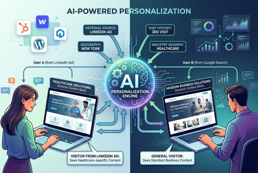
1. AI-Powered Personalization
The era of one-size-fits-all website experiences is ending. AI-powered personalization in 2026 means websites that adapt in real time to who a user is and what they appear to want, serving different content, headlines, calls to action, or even navigation paths based on behavioral signals.
This is no longer just an enterprise feature. Platforms like HubSpot, Webflow, and even advanced WordPress setups allow dynamic content blocks that change based on factors like referral source, geography, visit history, or industry segment. A visitor arriving from a LinkedIn ad targeting healthcare companies can see a homepage speaking directly to healthcare without any manual segmentation by your team.
The data on personalized UX is strong. According to McKinsey’s 2026 personalization report, companies that excel at personalization generate 40% more revenue from those activities than average players. For business-to-business sites, especially, where sales cycles are long and trust takes time to build, showing relevant content at the right moment compresses that cycle significantly.
What this means for your website: Start with the basics before building a full personalization engine. Adding dynamic CTAs that change based on traffic source is a high-value, low-complexity win. Segmenting your homepage messaging for your two or three primary audience types is next. Full adaptive content comes later.
Who it’s for:
2. Conversational UI Beyond the Basic Chatbot
The chatbot wave of the early 2020s mostly produced annoying popups that asked “Can I help you?” within three seconds of landing on a page. In 2026, conversational UI has matured into something genuinely useful, and businesses are seeing results that justify the shift.
Modern conversational interfaces do more than answer FAQ. They qualify leads before routing to a sales rep, guide users through complex service selection, help visitors find the right product or plan, and in some cases, complete transactions entirely within the chat experience. AI tools like Claude, GPT-4, and purpose-built chatbot platforms are making this level of sophistication accessible without enterprise-level budgets.
What separates the good implementations from the annoying ones is intent. The best conversational UX treats the chat interface as a concierge available if needed, not intrusive when not. It triggers contextually (someone spending 90 seconds on the pricing page probably has a question; someone who just landed probably doesn’t). And it’s designed around the user’s goals, not around lead capture.
What this means for your website: If you run a service business with a qualifying process, consulting, legal, home services, or healthcare, a well-configured conversational tool can meaningfully increase the rate at which site visitors turn into actual conversations. Start with intent mapping: what are the three most common questions your sales team answers before a deal moves forward? Build your conversational UX around answering those.
Who it’s for:
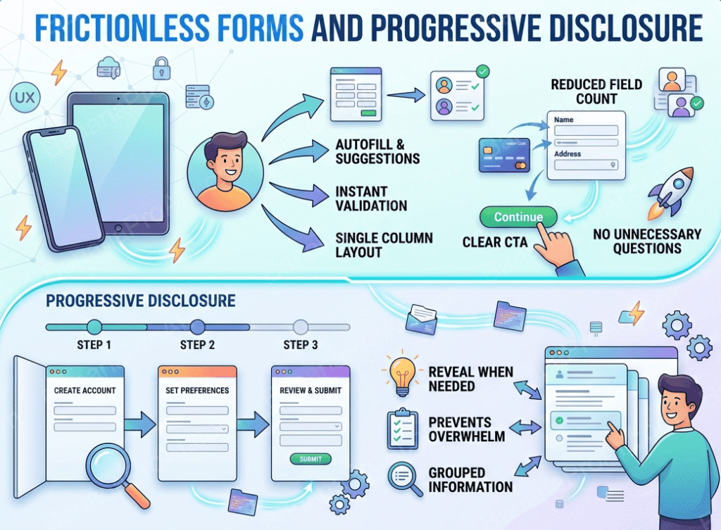
3. Frictionless Forms and Progressive Disclosure
Forms are where most business website UX dies. The instinct to collect as much information as possible up front, name, company, phone, email, project type, budget range, timeline, how you heard about us creates a wall that stops prospects cold. Research from Unbounce consistently shows that reducing form fields from 11 to 4 can increase conversion rates by over 120%.
Progressive disclosure is the 2026 answer to this problem. Instead of presenting everything at once, you show only what’s needed in the moment. A multi-step form that asks one or two questions per screen, gives clear progress indicators, and builds investment as the user proceeds, gets completed at significantly higher rates than a long single-page form.
The supporting UX principles matter too: inline validation that tells users what’s wrong as they type (not after they submit), smart defaults that pre-fill information where possible, visible field labels that don’t disappear into placeholders, and clear error messages that explain how to fix the problem, not just that a problem exists.
What this means for your website: Audit every form on your site right now. How many fields does your primary contact form have? If it’s more than five, test a shorter version. Then look at whether you can break longer forms into multi-step flows. The friction reduction on conversions is almost always worth the development time.
Who it’s for:
4. Trust-First Design Patterns
In an environment where AI-generated content is everywhere and every business has a professional-looking website, the visual and structural cues that establish trust have become more important than ever. Trust-first design is the deliberate placement and formatting of credibility signals to reduce visitor hesitation and increase the confidence needed to take action.
This includes: real photography of real people (team photos, project photos, behind-the-scenes content), prominently placed third-party reviews and logos, specific social proof rather than generic claims (not “hundreds of happy clients” but “47 projects completed in the Pacific Northwest this year”), security indicators on forms and checkout pages, and clear “about us” content that establishes who is actually behind the business.
The research on this is consistent. BrightLocal’s 2026 Local Consumer Review Survey shows that 91% of consumers read online reviews before making a purchase decision, and the placement and format of those reviews on your website directly influence whether they register at all. A five-star badge buried in the footer does almost nothing; the same content as a structured testimonials section above the primary CTA does a lot.
What this means for your website: Map out your trust signals and assess their placement. Are your best testimonials above the fold or below it? Do you have real photography or stock photos? Is there a clear, human “about” story? These aren’t design extras, they’re conversion fundamentals.
Who it’s for:

5. Thumb-Zone Optimization and Touch-First Mobile UX
By 2026, mobile accounts for over 60% of global web traffic, and the way people use mobile devices shapes what good UX looks like. Most users hold their phones with one hand, and their thumb can comfortably reach a predictable zone in the lower-center portion of the screen. Designing without this in mind means putting critical interactive elements, navigation, CTAs, and form submit buttons in the hardest-to-reach areas.
Thumb-zone optimization isn’t just about button placement. It’s a set of design decisions that reflect how mobile users actually interact: larger tap targets (44x44px minimum, per Apple’s HIG), bottom-sheet navigation patterns that keep key actions within thumb reach, swipe gestures for content navigation, and page layouts that put the most important content and actions front and center rather than buried in scroll.
A closely related issue is content density on mobile. Desktop-designed layouts that get “responsive” treatment often still push too much information into mobile views, creating visual noise that slows comprehension and frustrates navigation. True mobile-first UX starts with the phone and expands to desktop, not the reverse.
What this means for your website: Walk your website on your phone, with one hand, standing up. Can you navigate, find information, and submit a form without frustration? Better yet, watch someone else do it, you’ll see friction you’ve become blind to. The issues you find are likely costing you conversions every day.
Who it’s for:

7. UX Writing and Microcopy
The words on your interface are part of the user experience, not a separate concern. Microcopy, the small pieces of text on buttons, form labels, error messages, tooltips, empty states, and confirmation screens, shapes how users feel about interacting with your site at every step.
Bad microcopy creates friction. “Submit” as a button label tells users nothing about what happens next. “An error occurred” as a form error tells users nothing about how to fix it. “Enter a valid email” tells users only that they did something wrong, not what that wrong thing was.
Good microcopy removes friction and builds trust. “Send me a free quote” on a contact form button is more compelling than “Submit.” “Looks like that email has a typo — try again?” is more helpful than “Invalid email format.” “We’ll reply within one business day” set after a contact form confirms what happens next and sets expectations that reduce anxiety.
According to NN/g’s 2026 UX Trends Report, improving interface copy is one of the most cost-effective UX improvements a business can make — requiring no development resources and often producing measurable conversion lifts within days of implementation.
What this means for your website: Read every word on your primary conversion path out loud. Does it sound human? Does it tell users exactly what to do and what to expect? Error messages and form labels are the highest-leverage starting points.
Who it’s for:
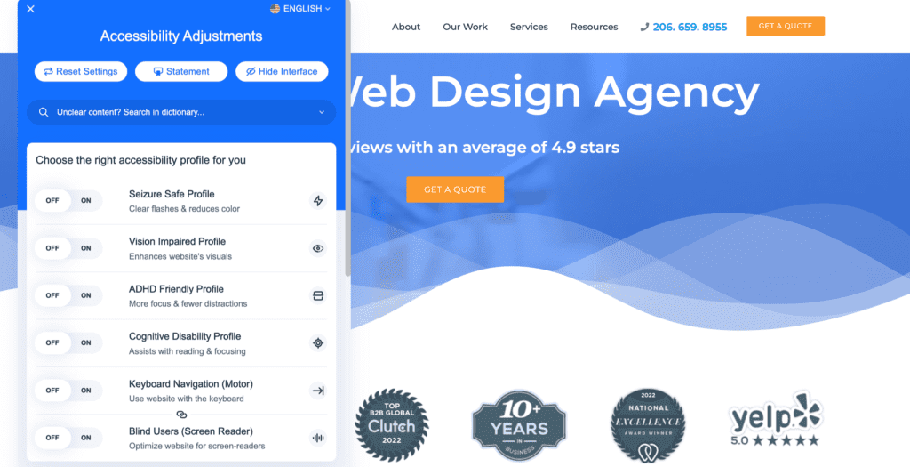
8. Accessibility as Standard Practice, Not Compliance
For most of the past decade, web accessibility was treated as a legal box to check, something you thought about only when a compliance issue arose. In 2026, that framing is outdated, and not just for ethical reasons. Accessible design is measurably better design, full stop.
The overlap between accessibility improvements and general UX improvements is extensive. Higher color contrast ratios (the WCAG 2.1 AA minimum is 4.5:1 for body text) are easier to read for everyone — not just users with low vision. Keyboard-navigable interfaces work better for power users and mobile users. Logical heading hierarchies that make sense to screen readers also make sense to Google’s crawlers and to users who skim. Clear, visible focus states help users who navigate by keyboard or switch access devices.
The business case is also strengthened by scale. The CDC estimates that 1 in 4 Americans has some form of disability affecting internet use. That’s not a niche audience. It’s a significant portion of any business’s potential customer base, and it’s a group that’s increasingly vocal about choosing businesses that design with them in mind.
What this means for your website: Run a free accessibility audit at wave.webaim.org. Common issues — missing alt text, poor contrast ratios, unlabeled form fields, and keyboard traps are almost always fixable without a redesign. Addressing them typically improves the experience for everyone on your site, not just users with disabilities.
Who it’s for:
9. Performance as a UX Decision
Page speed has always been a technical metric. In 2026, forward-thinking design teams have fully internalized it as a UX one. Every render-blocking script, every unoptimized image, every third-party widget that loads before your content is a UX decision with direct consequences for how your users feel when they arrive.
Google’s Core Web Vitals — Largest Contentful Paint (LCP), Interaction to Next Paint (INP), and Cumulative Layout Shift (CLS) give you concrete, measurable benchmarks for performance as it relates to user experience. LCP measures how long it takes for the main content to appear. INP measures how quickly the page responds to user interactions. CLS measures whether content jumps around while loading, causing misclicks.
The conversion data on performance is unambiguous. According to Google’s own research, every 100ms of additional load time reduces conversion rates by 1%. A site that scores in the “needs improvement” range on Core Web Vitals isn’t just slower, it’s likely losing a meaningful percentage of its conversions every day, and ranking lower in search results as a result.
What this means for your website: Check your Google PageSpeed Insights score right now at pagespeed.web.dev. If your mobile score is below 70, performance improvements will have more impact on your results than any visual change. The most common culprits: unoptimized images (use WebP format and lazy loading), excessive third-party scripts (audit what’s actually being used), and themes or page builders with significant CSS/JS overhead.
Who it’s for:
10. Data-Driven UX and Continuous Iteration
The traditional web design model, build it, launch it, move on, is being replaced by a more disciplined approach: build, launch, measure, improve. Data-driven UX means using real user behavior (not assumptions) to make decisions about what to change and in what priority order.
The tools available for this in 2026 are more accessible than ever. Microsoft Clarity, Hotjar, and Google Analytics 4 all offer session recordings, heatmaps, and funnel analysis that reveal exactly where users are getting stuck, what they’re ignoring, and what paths they’re taking that you didn’t design for. Combined with qualitative data from user interviews or surveys, these tools give you a complete picture of the gap between the experience you think you’ve designed and the one your users are actually having.
Even small improvements, applied systematically, compound over time. A 5% improvement in conversion rate every quarter is a 22% annual gain. The businesses winning with their websites in 2026 are the ones treating UX as a continuous practice, not a one-time project.
What this means for your website: Install Microsoft Clarity (it’s free) and watch five session recordings of users who bounced without converting. You will see something actionable in almost every session. Set up a goal in Google Analytics 4 for your primary conversion (form submission, phone call, etc.) so you can measure the impact of any changes you make.
Who it’s for:

The Common Thread Across All These Trends
Every UX trend worth paying attention to in 2026 shares a common logic: respect the user’s time, reduce their uncertainty, and make it easier to do what they came to do. Personalization removes irrelevant content. Conversational UI answers questions faster. Frictionless forms remove unnecessary steps. Trust design reduces hesitation. Performance removes waiting. Data-driven iteration removes assumptions.
The businesses seeing the best results from their websites aren’t the ones with the most impressive design. They’re the ones with the most intentional UX. That’s a meaningful distinction.
Before chasing any specific trend, start with the basics: Is your site fast on mobile? Is your primary call to action clear? Do your forms work without friction? Can a first-time visitor understand what you do and who you serve within 10 seconds? Getting these fundamentals right is the highest-leverage thing most business websites can do in 2026.
For more resources, see our 22 User Experience Design Principles for Websites article.
Partnering With the Right Team for UX-Led Design
The challenge with most of these improvements is that they’re easy to identify and harder to execute well. Data tells you where the friction is good. UX design judgment tells you how to remove it in a way that holds together across the full site experience.
At Sayenko Design, we approach every project UX-first. That means starting with who your users are, what they need from your site, and what success looks like before we touch visual design or development. It means building conversion-optimized contact forms, mobile-first layouts, and performance standards into the foundation of every project. And it means measuring results after launch, not just handing over a finished file.
If you’re planning a website project in 2026 and want a partner who takes UX as seriously as we do, let’s start a conversation:
Frequently Asked Questions About UI/UX Trends 2026

Learn the Correct Web Design Process
Get a one page PDF on what a professional web design process looks like. Fill out the form below.
Learn the Correct Web Design Process
Get a one page PDF on what a professional web design process looks like. Fill out the form below.