Web design trends will vary from year to year, so one thing to keep in mind before we get started – don’t feel the need to jump at trends just for the sake of keeping up. Always think of your target audience first (create and follow a professional web design strategy), and what will add value and enhance their overall user experience. If your audience is from an industry or niche that is slower to react to change then consider their expectations first. Examples of these types of audiences could include healthcare professionals, automotive, C-level executives, or real estate. That being said, even the most traditional of audience segments will eventually warm to newer trends, it just might take them a while.
In recent years, and even more so in 2020, the focus in web design trends has shifted ever more to seamless usability and registering the right emotional impact. Top web design Seattle agencies are building websites that are designed to both make a statement, and push the user to an end goal or conversion. Below are ten technology web design 2020 trends to help websites differentiate from the competition, and stand out, by enhancing overall brand identity and website flow.
Interested in how these 2020 web design trends compare to this year?
Check out our top 10 web design trends in 2021 article.
Top 10 in 2020 Web Design Trends
1. Bright and Vibrant Color Schemes
In the past it’s been muted color tones, but for 2020 bright and vibrant is in. With this trend, the potential for creativity (and capturing the eye) is bolstered by unlocking traditionally ignored ranges of the color palette.
Displays are more vivid than ever, particularly on mobile devices, and flashier colors capitalize on this. The industries utilizing this trend most is product-based B2C technology, artificial intelligence, and SaaS companies. Color schemes such as magento, bright blues and greens are among the favorites.
When to use it?
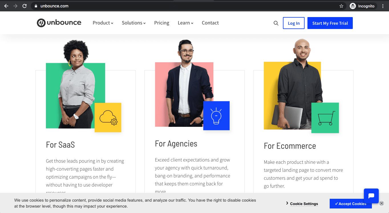
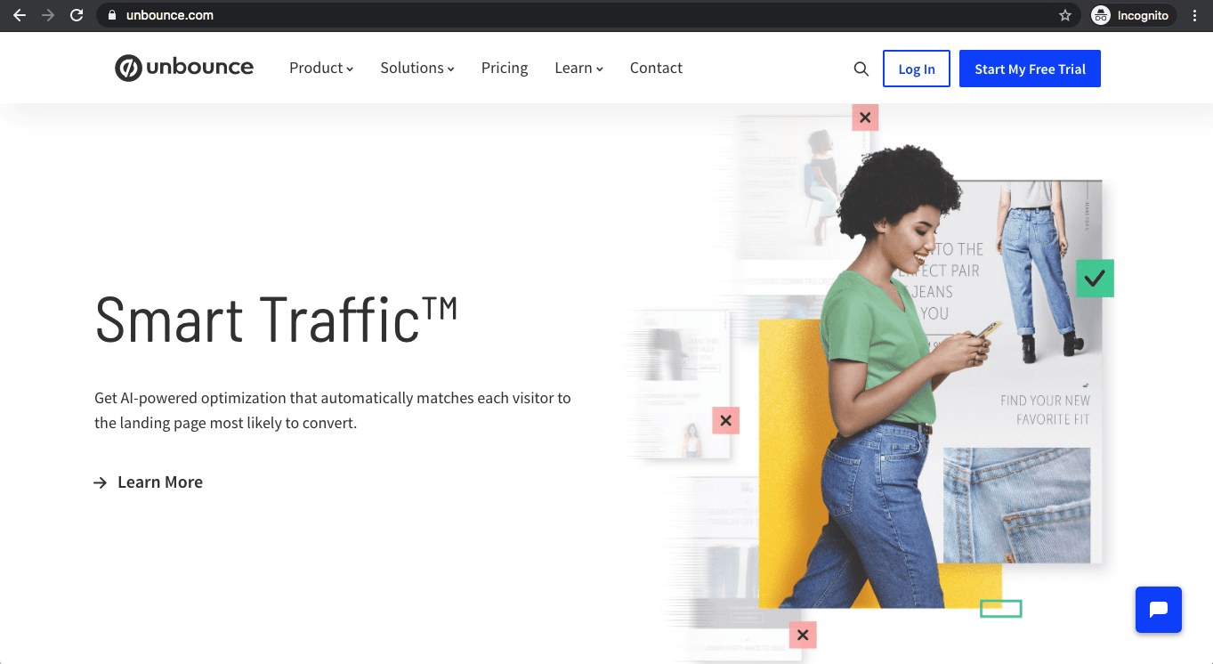
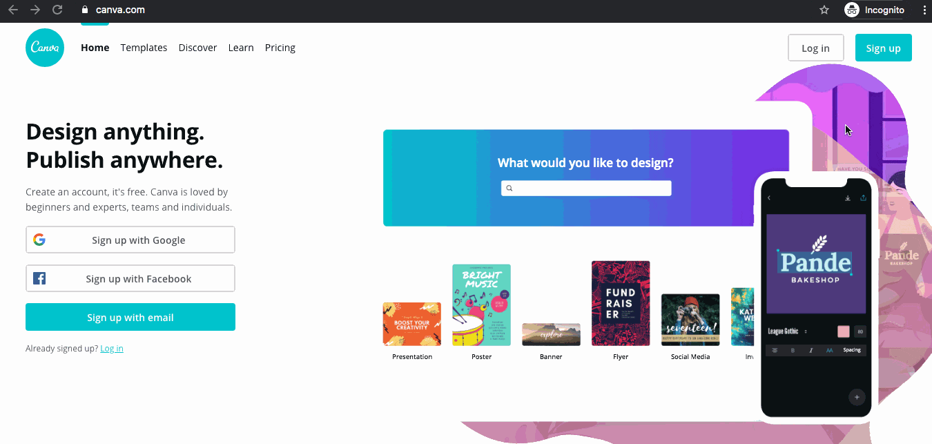
2. Collage Images
Collage images, which can also be combined with design treatments, leave a memorable impression on visitors. This presentation format gives the images a unique, fresh feel. Combine images with graphics that match your brand design language and personality. Incorporate design treatments and shapes from your logo mark, background image patterns, icons, etc.
Why use it?
3. Line Art
Line art icons have been trending upwards since 2019, and you can look for that trend to continue into 2020. Line art gives a fresh, unique, and custom feel when compared to filled in icons, which can feel more “stocky”. Most websites in the past have utilized Font Awesome libraries (web’s most popular icon set and toolkit) in the past, which can lead to a lot of repetition across the web.
Why use it?
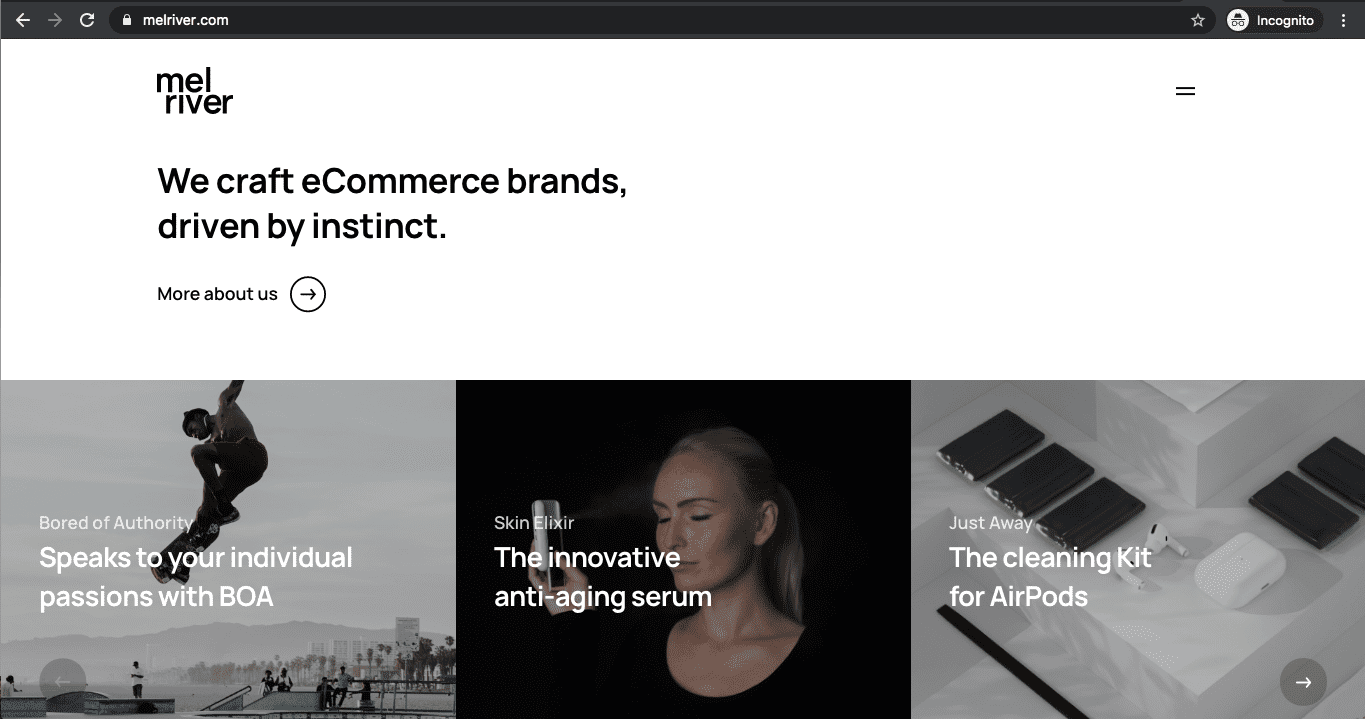
4. Floating Elements
For the past 5-8 years, websites have utilized rectangular blocks to define sections on a page. This sort of design feels more “templated”, limiting, and lacking uniqueness. In comparison, floating elements, well… float on the page. This is accomplished by the use of white backgrounds with off the grid elements, and no boxed in content.
Why use it?
5. Button Gradients
Gradient call to action buttons are very much a trend for 2020. This top trend gives a touch of texture to the page and helps your buttons to pop out of the background. Gradients 2.0 are either muted tones OR vibrant loud and in your grill. Usually, they utilize one or two colors. Do some A/B testing on a few different gradient buttons to see which style converts best.
Why use it?
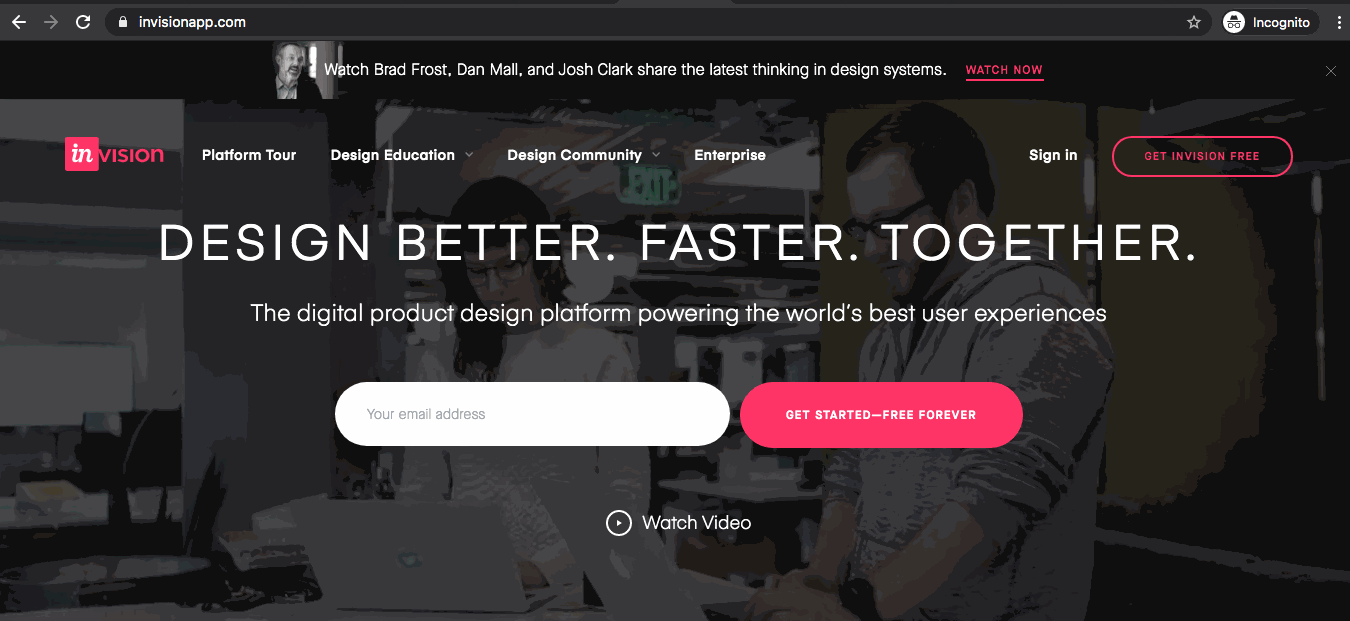
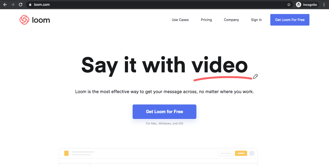
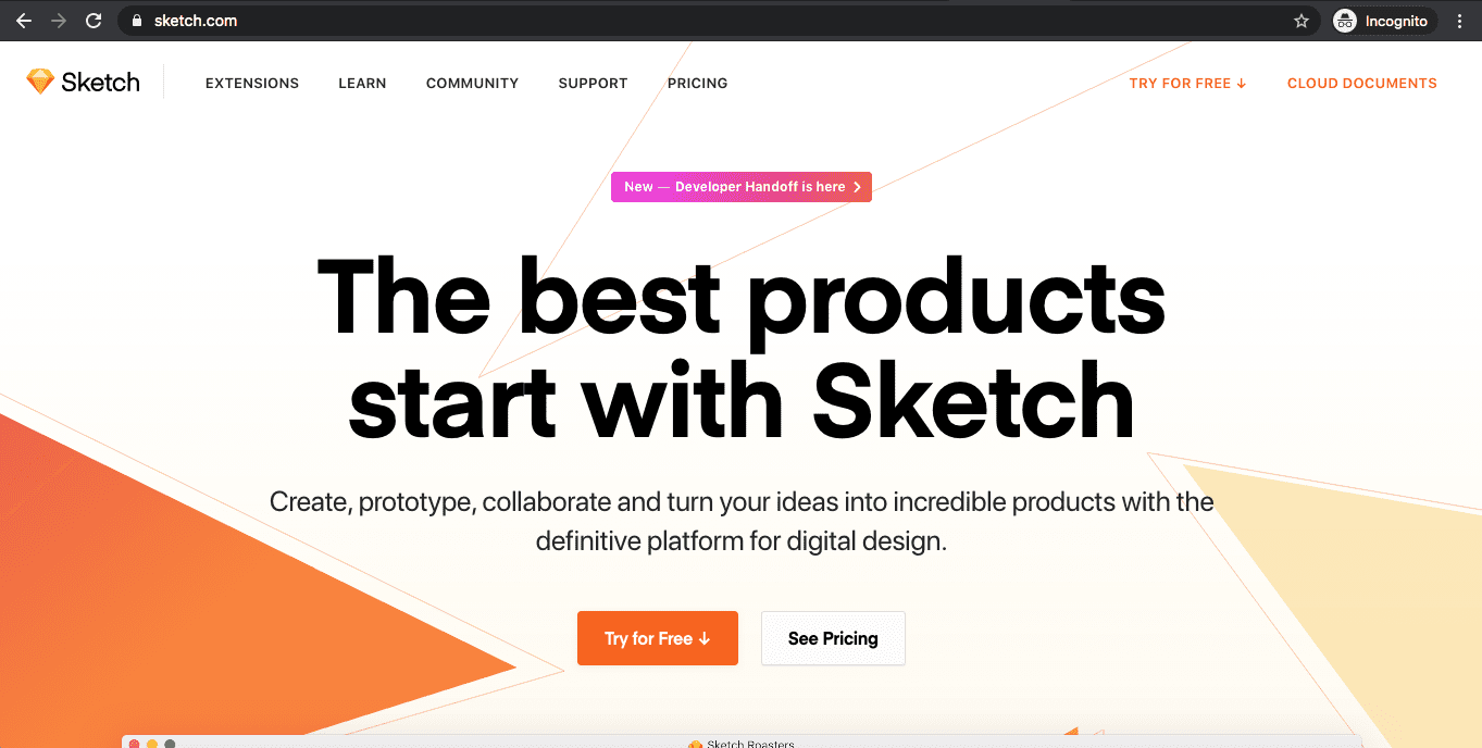
6. Hero Video Banner
Remember when all sites used a homepage image slider? We’ll that’s a thing of the past. While attractive at first, they are an all around bad user experience – no one waits to thumb through all those slides, and display/interaction issues can crop up on varying devices. Video banners are quickly replacing image sliders in the hero element as high-speed internet advances allow for improved (and more consistent) video streaming experiences.
This trend is here to stay. Get a leg up on the competition as most competitors likely aren’t utilizing this yet.
Video gives you the chance to build a brand narrative quickly, and tell a story through interactive and engaging visuals. Common themes for hero videos are clips or graphics highlighting work environment, team members, and (of course) products and services. These videos typically are 15-40 seconds long and looped. They can also be combined with an “explainer video” via a “watch more” button overlaying the muted background video. When clicked this opens up a pop up video player in the middle of the screen with audio. These more in-depth videos are typically 60-90 seconds in length, and their viewing represents a higher level of visitor interest).
Why use it?
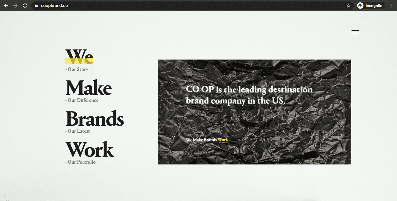
7. Oversized Fonts
Go big or go home? Yes! Larger LARGER LARGER is the trend. You’ll see more sites make use of large font sizes as they add visual impact, evoke a feeling and emphasize the message. They can also direct eyeballs to where they should look next. Keep in mind large fonts mean shorter headings, simpler imagery and color choices. Don’t overwhelm the user!
Why use it?
8. Animations triggered through interaction
Animation has always been a thing – think back to flash websites, rotating image sliders, etc. A lot of these didn’t require the user to do anything on the website. A big trend in 2020 is user-triggered animations such as icons with a hover effect, or animated gifs. A unique example of animation could be an instance where a user starts typing in their password, an animated animal might hide their eyes. Creating captivating micro-interactions will pleasantly delight users, and further enhance branding.
Why use it?
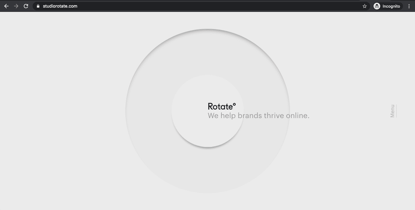
9. Ultra Minimalism
Ahh the art of less is more! Think of the different ways you can simplify your website user interface… ultra-minimal. The user will remember more about your website with less clutter to sift through. Web designers are trending towards using lots of blank space to improve readability, bring more attention to concise content and build an aesthetic. More design choices that follow this trend include: Minimal amounts of colors (typically just 1-2), headings and visuals with no paragraph text, hamburger menus, stripping away shadows or excess details.
As a bonus ultra minimalism usually translates to faster page load speeds.
Why use it?
10. Website Accessibility for the disabled
In 2020 more nonprofits and businesses will continue towards making their website accessible and welcoming to all. This all started with the Americans with Disabilities Act to improve access to websites for people with disabilities. This hits consumer-focused businesses the most – restaurants, eCommerce, hotels, tourism, real estate, etc.
The Web Content Accessibility Guidelines (WCAG) were created to standardize what is considered accessible and compliant. This includes small details like images having descriptive alternative text, and form buttons that have descriptive text and text labels. However, these guidelines can also inform larger design choices. To accommodate color blind web users, for example, interactive elements on a page must not use color as their only distinguishing aspect.
There is much, much more to web accessibility, and different complications for each industry and business. One thing is for sure web designers and developers will need to educate themselves and know how to work with these new requirements in mind!
Why use it?
To sum up 2020 web design trends,
Top web design trends have matured throughout the years. Some trends for 2020 are new and some are evolutions of previous, well publicized trends. Overall, it’s less about razzle-dazzle and more about crafting a design with the best user experience in mind, and building a great customer journey. Consider adding some of the above design trends to your site as part of a timely makeover, or perhaps, a more extensive website redesign.
What 2020 web design trends do you see as being the most popular? Feel free to comment below and give us your feedback.
Need help managing a redesign or want to see how your website could be spruced up with professional web design services? We can walk you through our web design process, our digital strategy services, and how our custom WordPress development can improve your online presence and overall business.

Learn the Correct Web Design Process
Get a one page PDF on what a professional web design process looks like. Fill out the form below.
Learn the Correct Web Design Process
Get a one page PDF on what a professional web design process looks like. Fill out the form below.