With 2020 in the rear view mirror and 2021 in full swing, businesses are putting a bigger emphasis on web presence to survive and thrive. The top 2021 web design Seattle trends we’re seeing have websites becoming more immersive, personalized and informative. Businesses are realizing their website is a marketing tool that must be up to date and current with things like COVID safety guidelines; use an intuitive and easy format to do business through; and provide powerful storytelling through its text, imagery and design to educate and build an emotional connection with potential customers.
Top 10 in 2020 Web Design Trends
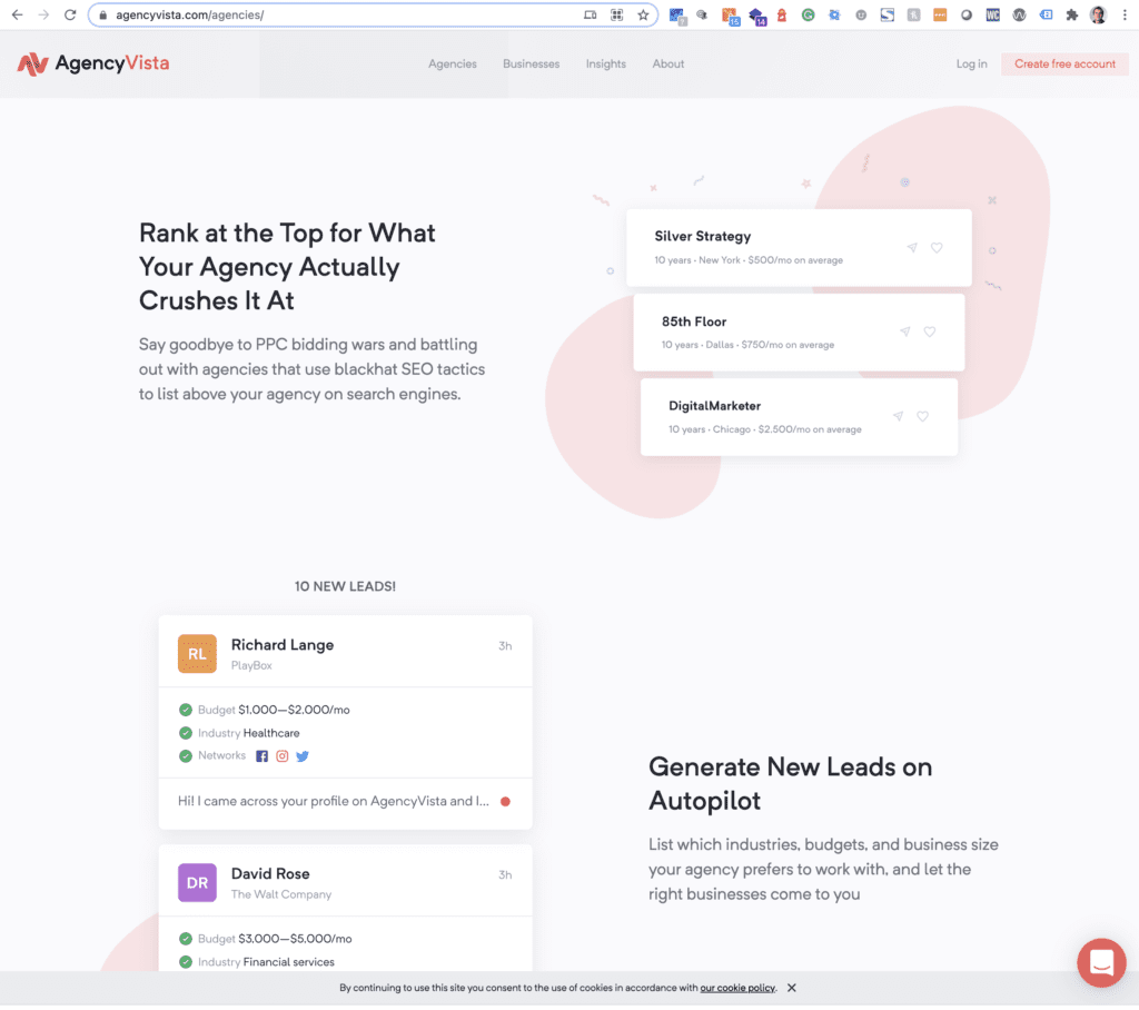
1. Focusing on trust builders
More businesses are online competing for fewer dollars in a tightening market, which makes buyers cautious and choosy. It’s more critical than ever to build trust and credibility on your business website. Visitors want to see what others are saying in reviews and testimonials, and they need proof of expected results whether they’re looking to hire a consultant, buy a product or sign up for a webinar. Increase their confidence in you by featuring as many of these as possible up front in your website’s layout. Someone scrolling through the homepage should find at least a couple trust builders.
Trust builders to use
2. Storytelling through visuals and interactions
Buyers are fickle and the internet is becoming more templatized. To stand out, catch attention and retain interest, businesses are realizing they need to tell their story in an interesting and experiential way. The impact needs to be felt quickly and clearly, with visuals, interactive elements, and animations that come together like a storybook. This helps your brand voice shine through, and carries visitors through the homepage scroll long enough to actually understand your business and its value.
How to use it?
3. Muted colors, white space & color-less design
A larger web design trend of 2021 is a movement away from the loud and popping colors that punctuated many sites over the last decade. Instead, businesses are leaning into aesthetic choices in the larger culture which emphasize natural colors and lighting, and muted colors and pastels. Not only does this give the design a clean, earthy feel, but it’s also less harsh on the eye without sharp contrast.
Some sites make themselves easier on the eye by using a significant amount of white space around most of their elements, which reduces the visual clutter, makes each individual element stand out more, and also improves page load speed—especially on mobile.
Still other sites forego color altogether in their core design, saving it for interactions like hovering over an element to really give them emphasis.
Why use it?
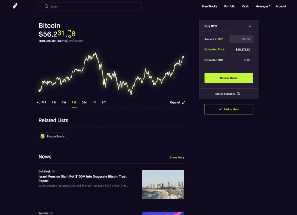
4. Dark mode
Dark mode is a web design trend in 2021 that goes beyond websites—every single app, mobile and desktop OS is offering dark mode as well. For practical purposes, not only does it strain the eyes less, but it also can reduce how much power on a mobile device is required since a black background takes no power to light up vs. a white background.
On the web, this is becoming a trend for technology-focused sites, especially those that use data visualization. This gives sites a sleek, high tech look and feel that is reminiscent of the dark mode common in text editing apps that coders use. You can be sure you’ll see more websites in 2021 switching to dark mode.
Why use it?
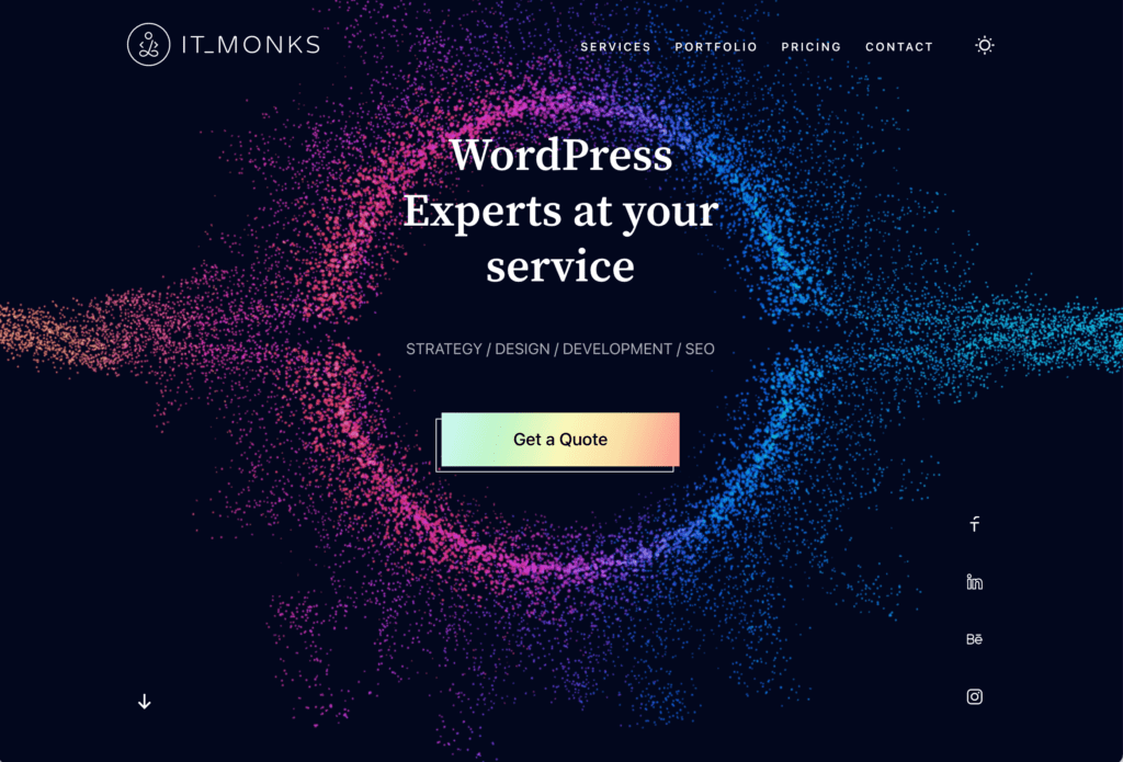
5. Gaussian blur (or Blur & Noise)
The favorite web design trend of six years ago is making a comeback in 2021. Applied to a site especially in the background, it helps your text and foreground elements stand out even when you don’t have much good content in the background, since it all gets reduced to a colorful blur. It’s similar to the depth of field effect in a good photo. This treatment gives a website a sense of sophistication, depth, uniqueness and visual interest, and is a big improvement over a common or cheesy stock photo. This also gives your design a sense of freshness.
Why use it?
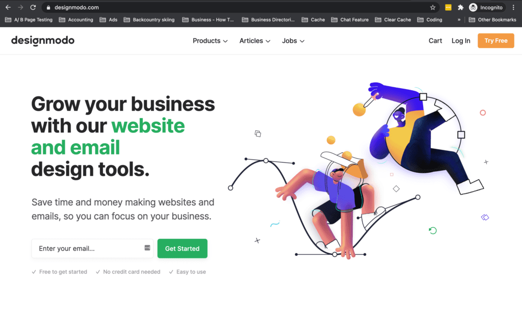
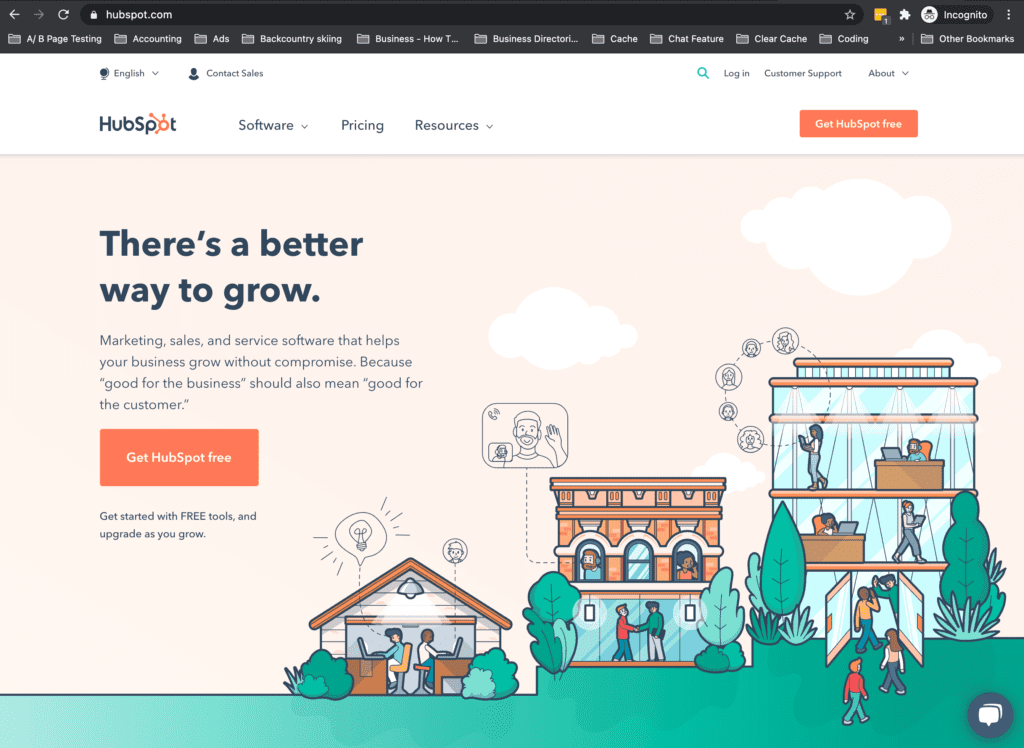
6. Cartoon illustrations
This trend was brewing in 2020 and it’s in full effect now, ready to breathe a fresh new life to your 2021 web design where stock images might not do the job. You can choose from a wide variety of flat vector illustration sets that have come out recently, including diverse options, to help tell your story and explain your product in a light, poppy way. You can also go custom if you cannot find an illustration that exactly fits your theme, as the vector style is relatively low effort compared to full fledged illustrations. Cartoon illustrations are gaining traction, especially among product based apps, technology and SAAS companies.
Why use it?
7. Scrolling slides
A great way to engage your audience with subtle animation is to have scrolling horizontal or vertical slides. As you move your mouse a new slide appears, which keeps each section of your site nice and balanced. This also works well for mobile designs, where visitors swipe up to move between each slide like they would on an app. More and more websites are following suit in 2021 making this more of an established trend. Be sure to separate the slides visually by giving each a different background color, and provide an indicator such as highlighted dots on the side so visitors know how far along they are.
Why use it?
8. Captivating questionnaires & dynamic content
Since more sites are competing for shorter attention spans, there’s a trend in 2021 web design of businesses using questionnaires that help sort visitors to exactly the content they want right away. Compared to the old model of having them dig through pages of content to compare and make a decision, this new mode of web design treats each user as an individual.
Another thing this trend recognizes is user engagement—nobody really “likes” to fill in a form, and the more required fields the less likely they are to get filled in. But if the forms are multistep (only one or two questions per slide with animations between them), well-designed, and entertaining, don’t you think they’re more likely to fill it out?
This can be combined with progressive lead nurturing forms, which have a variety of fields like any other form, but only display a couple of them per visit. So on the first visit, you get the bare essentials, name and email. Next time around, the visitor (recognized by IP address or cookies) is prompted by that same form for their job title and industry. And different information the next time. It becomes like a series of new, fresh meetings, and the content to prompt them can be tailored to what you know about them.
When to use it?
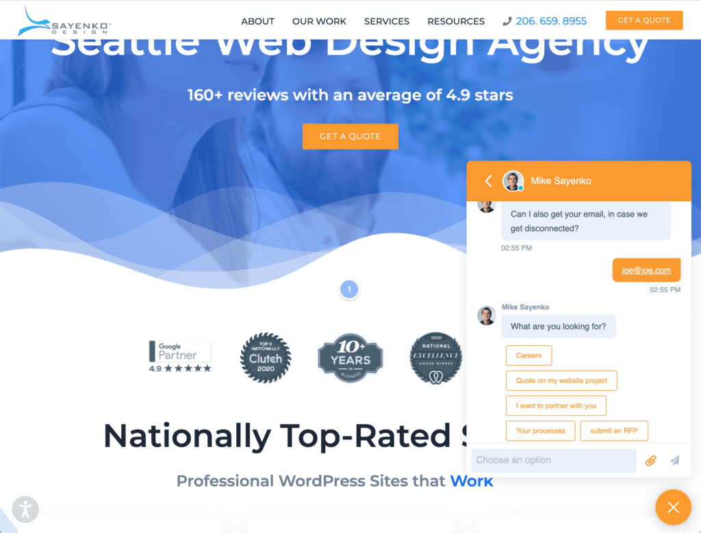
9. Human-like chatbots
This is a trend that is really taking off, with more and more sites leaning on a chatbot vs. hiring live chat help. The abilities of chatbots to offer personalized conversation and assistance will only get better with AI and machine learning. A chatbot is super helpful for driving users to web pages that answer their questions, connect with a sales rep, help those that want to partner with you, or point career seekers to job opportunities. And they often can tie into larger customer service and sales systems, and even take the place of forms for collecting customer information.
Why use it?
10. User Interface Personalization
One web design trend that ties in many of the other visual trends above is the ability to adjust user interfaces based on user preferences. This includes things like the ability to toggle between “dark” and “light” mode, adjusting font size, spacing, content scaling and alignment, and reduced motion to change the appearance of the website.
As a result, website experiences become individualized, reflecting one’s needs and style. This is going back to making the web more accessible, meaning it isn’t a fleeting design trend, but a new web standard that every website should be working to implement.
Why use it?
To wrap up 2021 web design trends
Keep in mind no matter what trends you chase and which you buck, these 2021 technology web design trends are taking off for a reason—enhancing your website experience and stand out from the many competitors out there with templated websites. They can’t and shouldn’t be all used together, but many work hand in hand to create modern experiences that keep visitors engaged and curious long enough to take the actions you want them to.
Need help taking advantage of these and other trends in your next website upgrade? See our professional web design service. We guide you through our process, along with our digital strategy services and custom WordPress development.
Interested in how these 2021 web design trends compare to last year?
Check out our 2020 web design trends article.

Learn the Correct Web Design Process
Get a one page PDF on what a professional web design process looks like. Fill out the form below.
Learn the Correct Web Design Process
Get a one page PDF on what a professional web design process looks like. Fill out the form below.